Teklo
A tech marketplace where you can easily search products, save favorites, and shop all in one streamlined experience.
Challenge: Technology is essential for daily life, but many people can’t afford expensive devices. This project focused on designing a simple, trustworthy marketplace to make tech more accessible at different price points.
Solution:We designed Teklo, a marketplace app that allows users to easily browse and buy technology at a variety of price points. The platform focuses on a simple and intuitive experience, helping users quickly find affordable devices while saving and organizing products they’re interested in.
Deliverables: User interviews, user personas, user journey mapping, low-fidelity wireframes, high-fidelity UI designs, interactive Figma prototype, design system and UI components.
Team:
Sam Popek and Evan Cass
Tools:
Figma, FigJam, Miro, user interviews, usability testing.
Timeline:
Aug 2025 - Present
Role:
UX Design & Research
Overview
Teklo was originally created during my undergraduate studies as part of a project focused on the United Nations Sustainable Development Goal of No Poverty, which highlights the importance of improving access to technology and economic resources. Our team explored how limited access to technology can prevent people—especially in rural or underserved communities—from accessing opportunities in education, work, and daily life.
For my portfolio, I redesigned Teklo to better showcase my current UX design skills and creativity. The updated concept focuses on a community marketplace where users can easily buy and search technology at a range of price points, helping make devices more affordable and accessible.
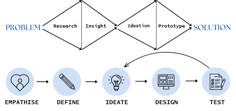
Design Process
Focus Groups
To better understand user needs, we focused on 2 main groups: students/young adults and budget-conscious buyers. Students often need affordable laptops, tablets, and accessories for school but may not be able to afford full retail prices. Budget-conscious buyers are looking for reliable technology at lower price points for work, education, or everyday use.

Budget Conscious Buyers

Students/Young Adults
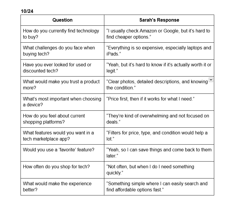
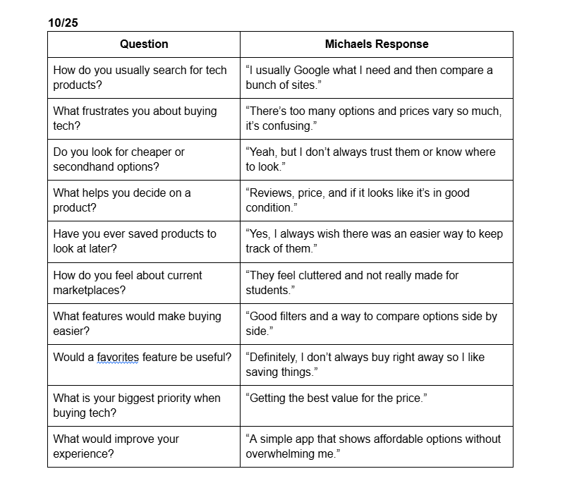
User Interviews
To better understand the needs of potential users, I conducted two user interviews, primarily with students who regularly buy technology. These conversations helped uncover common challenges such as the high cost of devices and difficulty finding reliable tech. The insights from these interviews helped guide key design decisions and features for Teklo, focusing on affordability, simplicity, and creating a trustworthy marketplace experience.
Here below are my user interview questions, and responses:
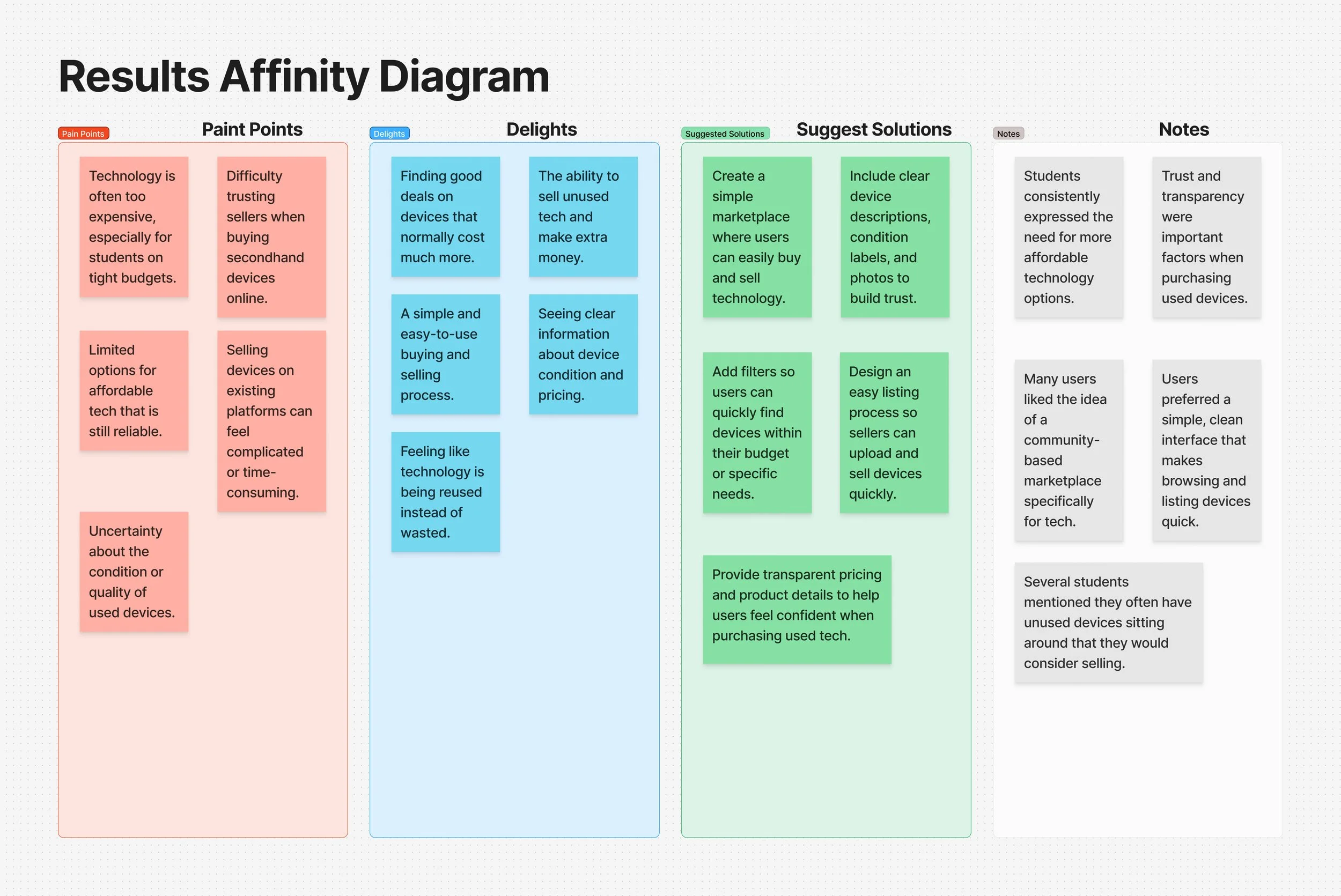
Affinity Diagram
After conducting user interviews, I organized the responses into an affinity diagram to identify common themes and patterns. By grouping similar ideas, concerns, and suggestions together, it helped highlight key user needs such as affordability, trust when buying used devices, and the importance of a simple buying and selling process. This step helped guide the main design priorities for Teklo.
Below is the affinity diagram created from the user interview responses:
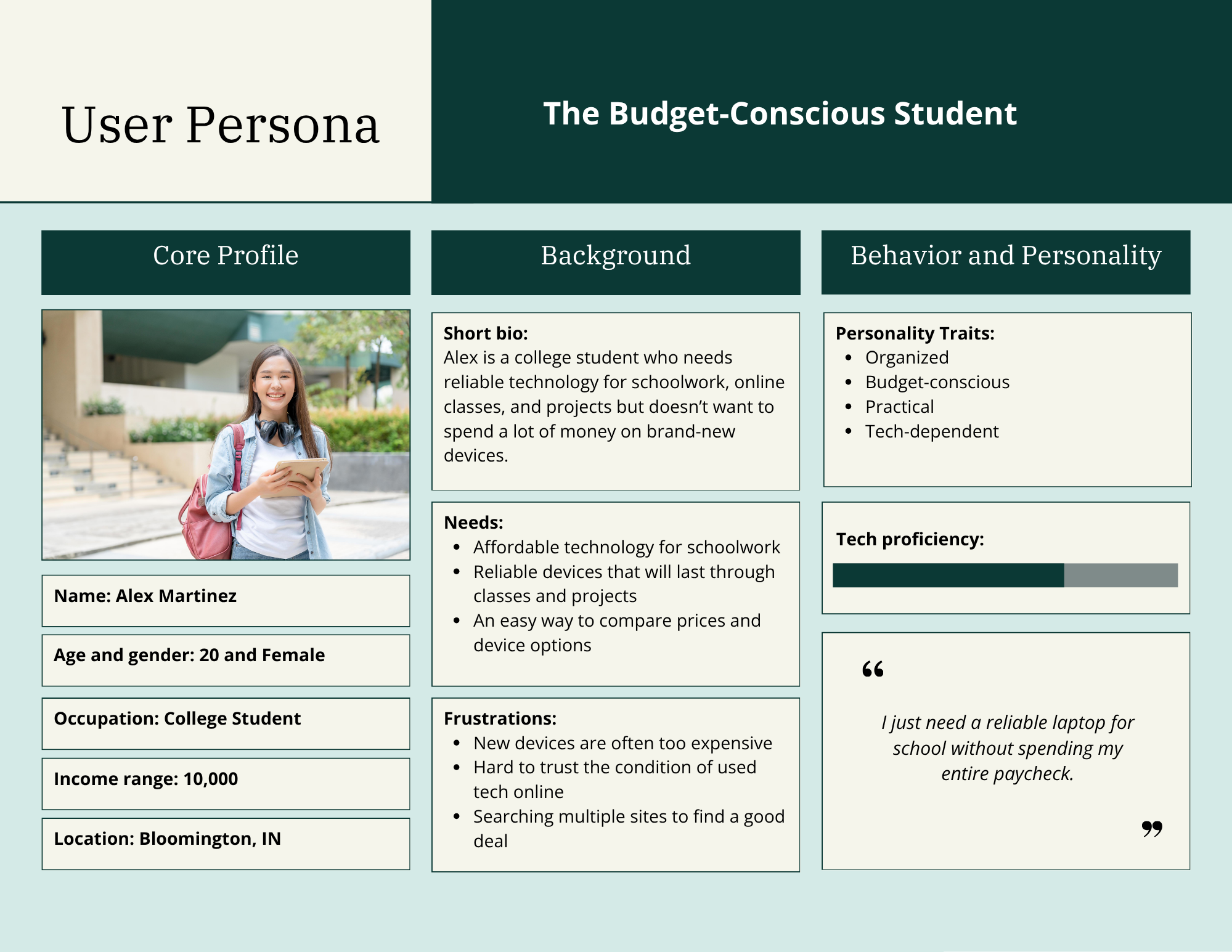
User Persona
The personas were created based on insights gathered from user interviews to represent the primary types of users who would interact with Teklo. They highlight key goals, needs, behaviors, and frustrations of buyers navigating the platform. By grounding the design in real user experiences, these personas helped uncover important priorities such as affordability, trust, and ease of use when searching for technology.
Wireframes
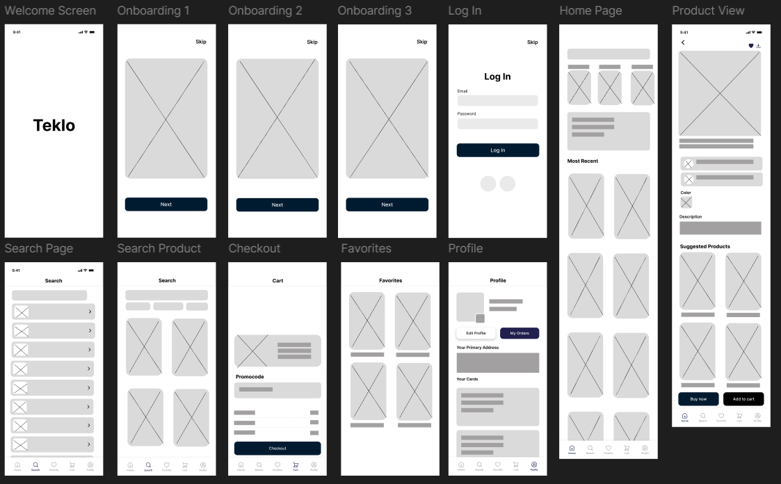
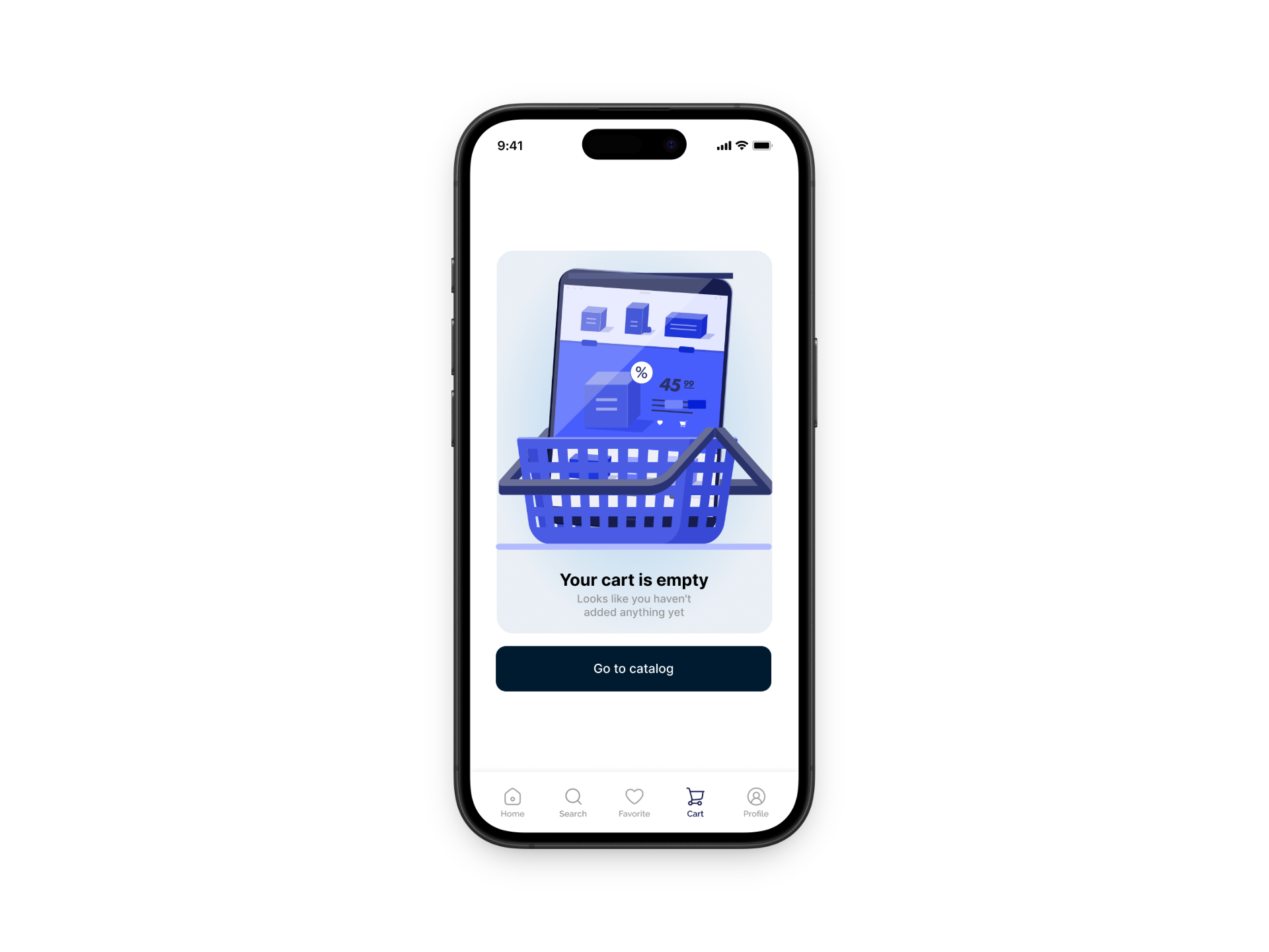
I created wireframes to map out the core structure and user flows of the Teklo app before moving into high-fidelity design. At this stage, I focused on layout, navigation, and functionality rather than visual details, allowing me to quickly explore different ideas and iterate on the experience. The wireframes helped define key screens such as browsing products, viewing item details and adding items to cart.
By keeping the designs low-fidelity, I was able to test and refine the overall flow to ensure it was simple, intuitive, and easy to navigate. This step was important in identifying what worked best for users before investing time into the final visual design.
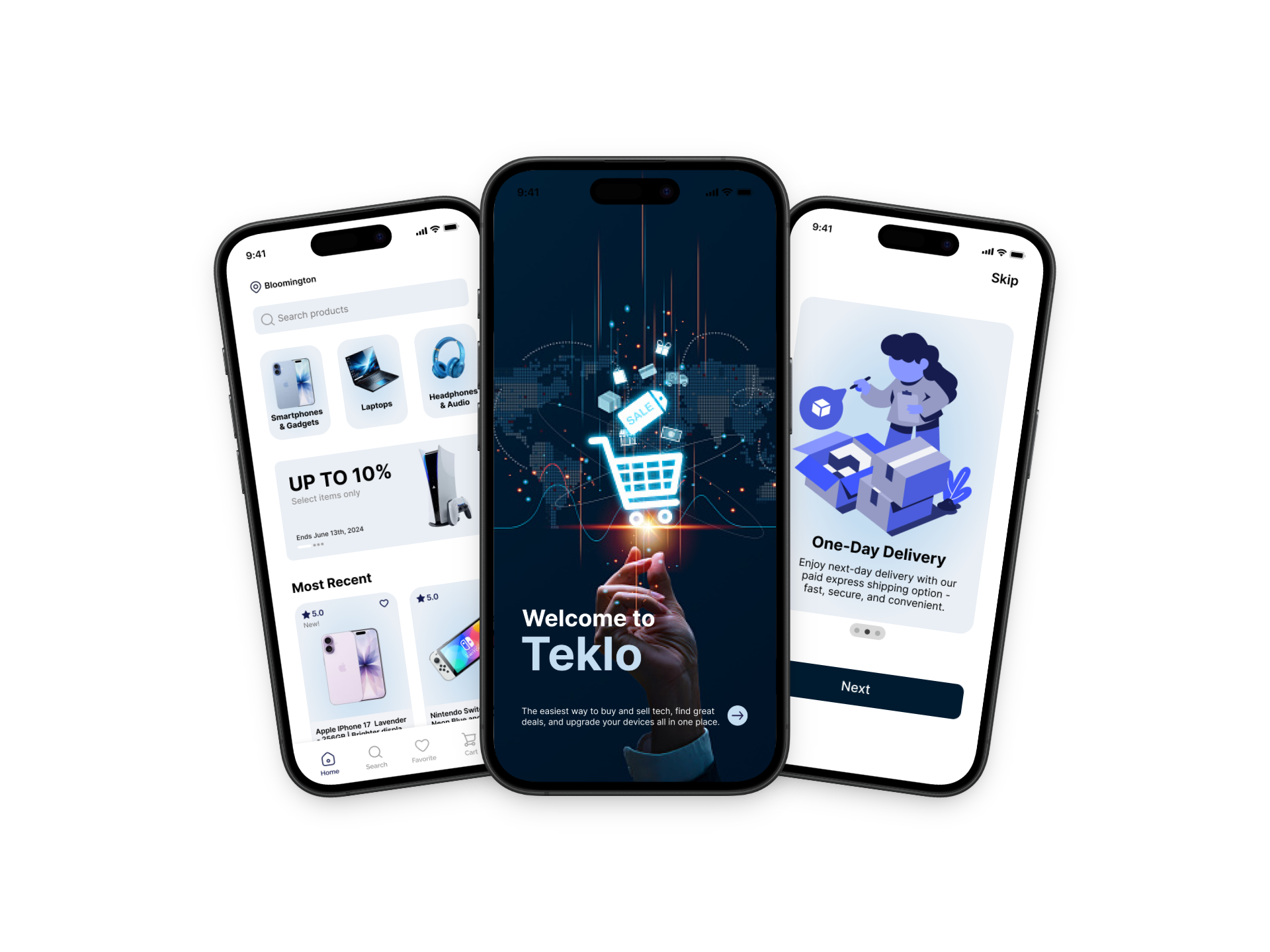
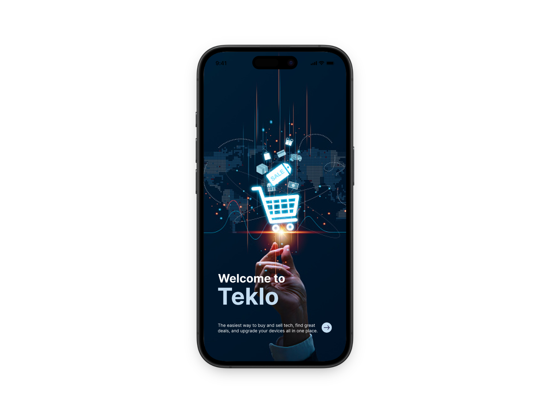
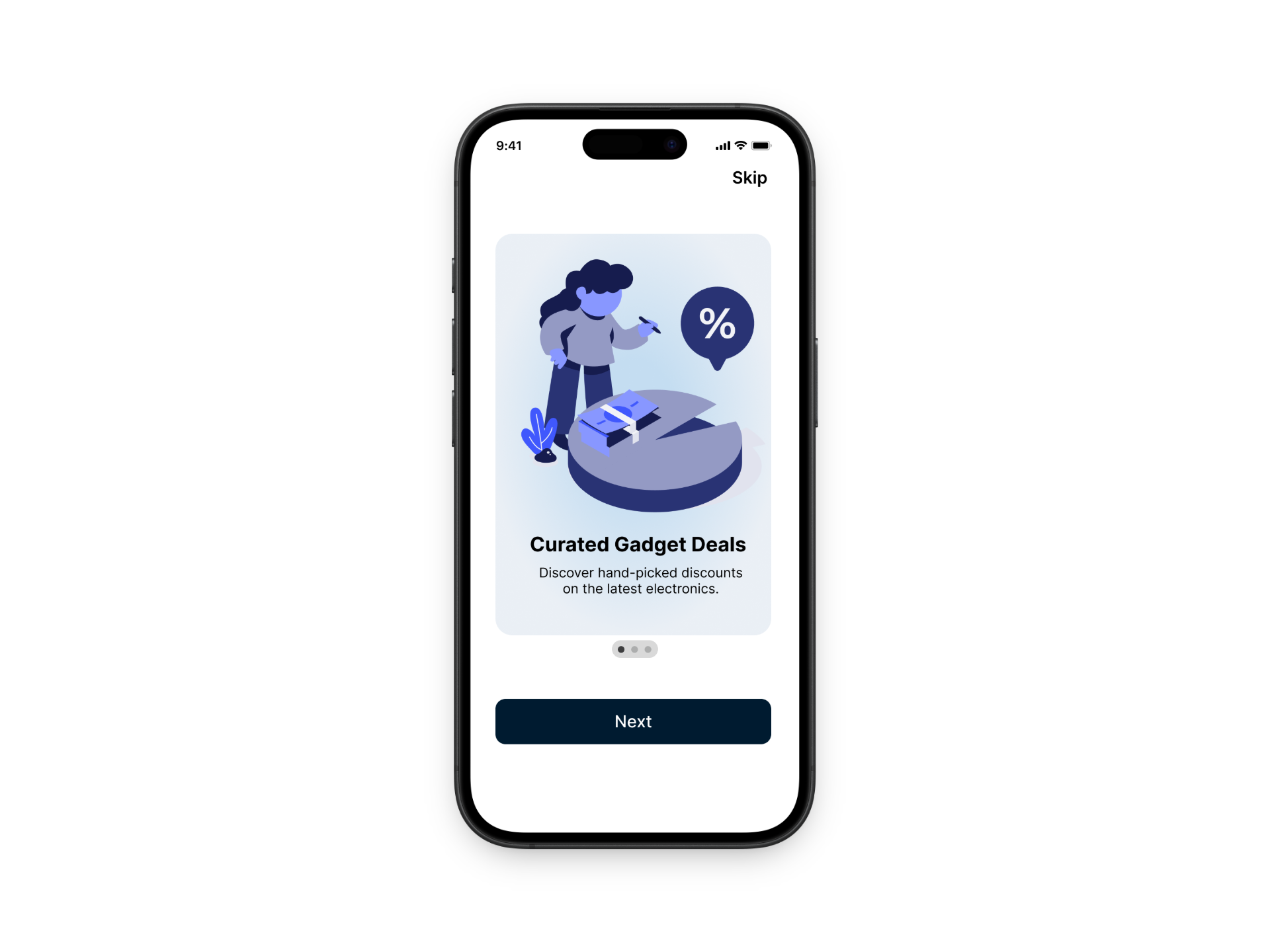
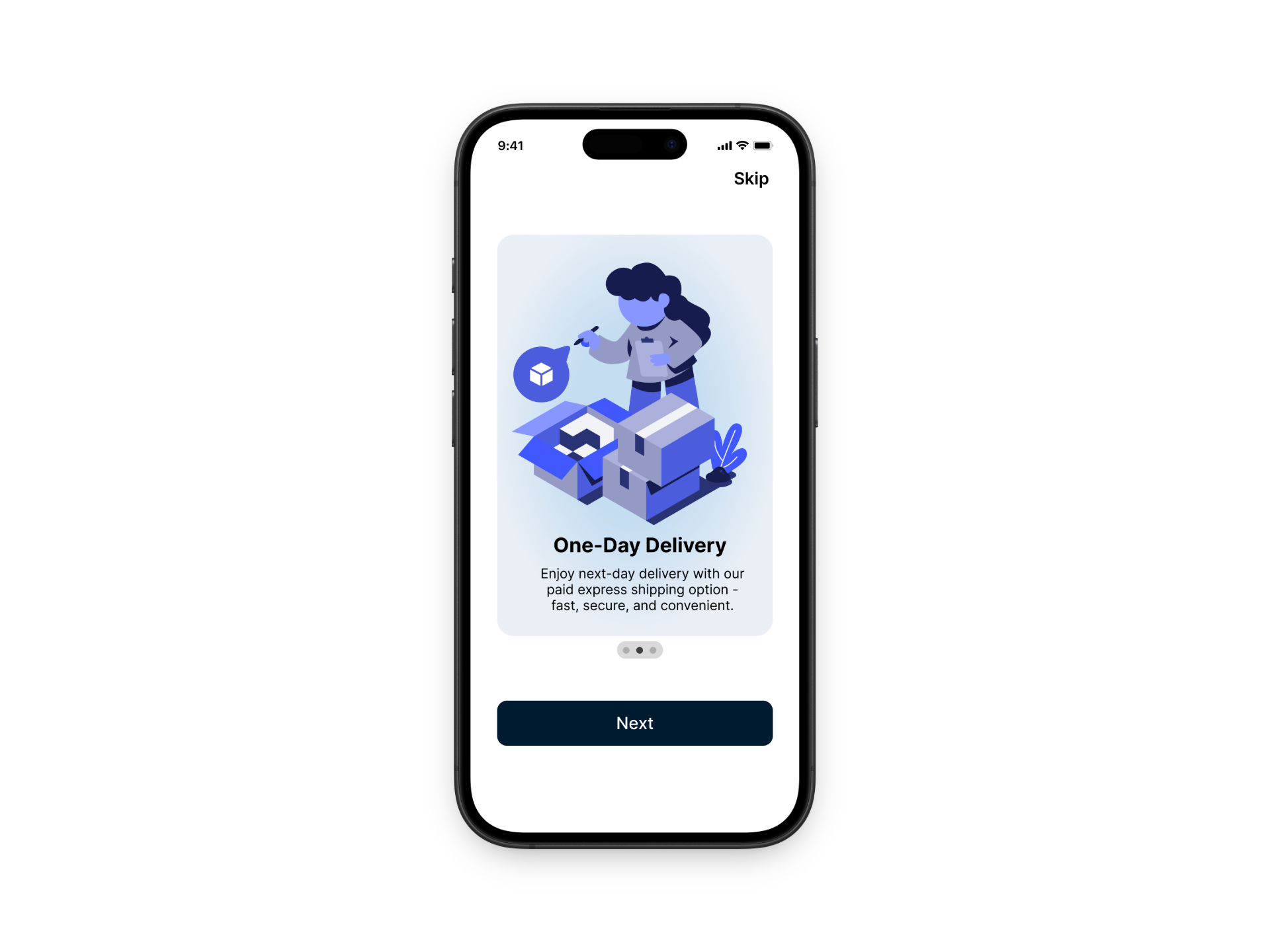
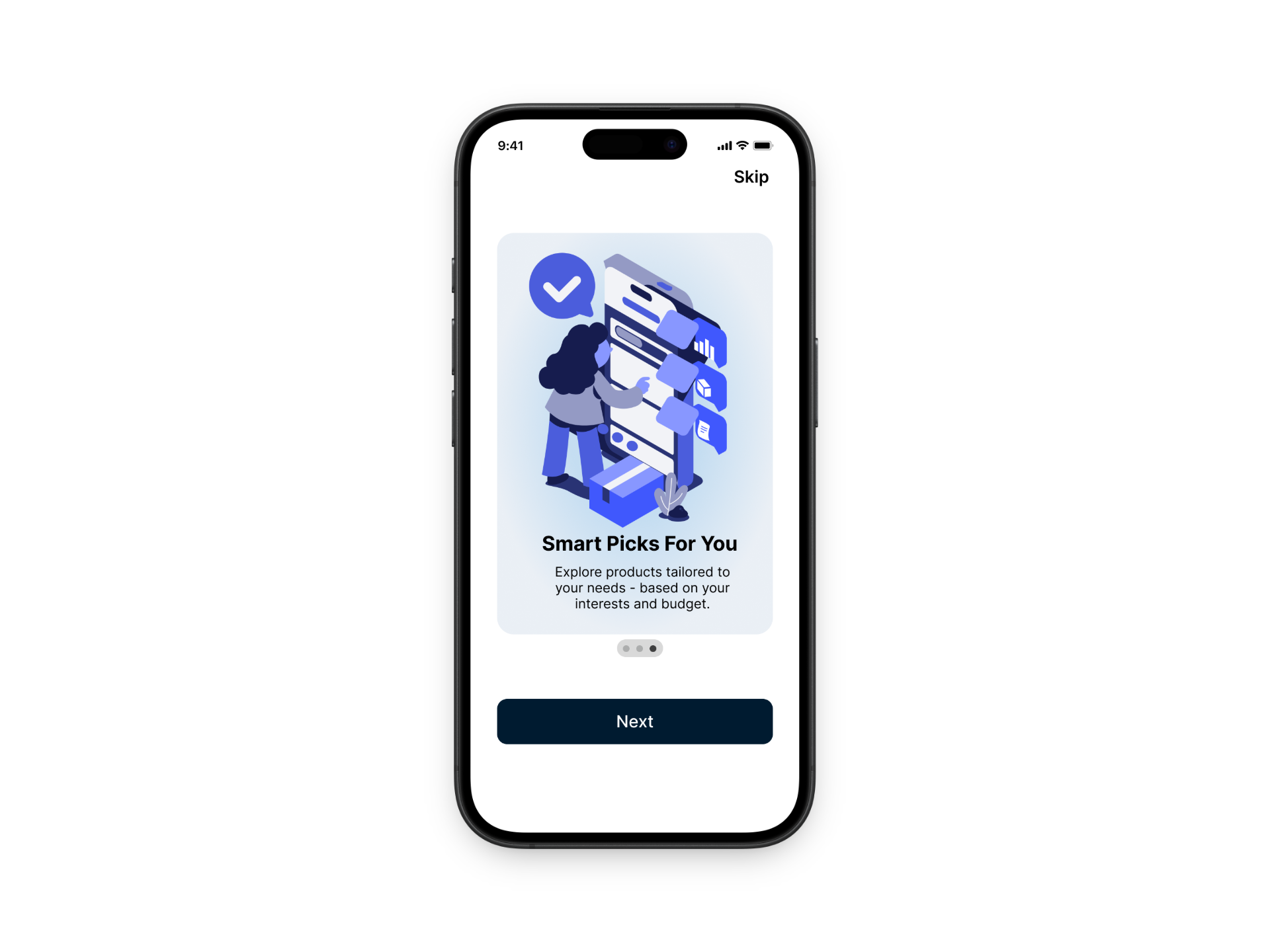
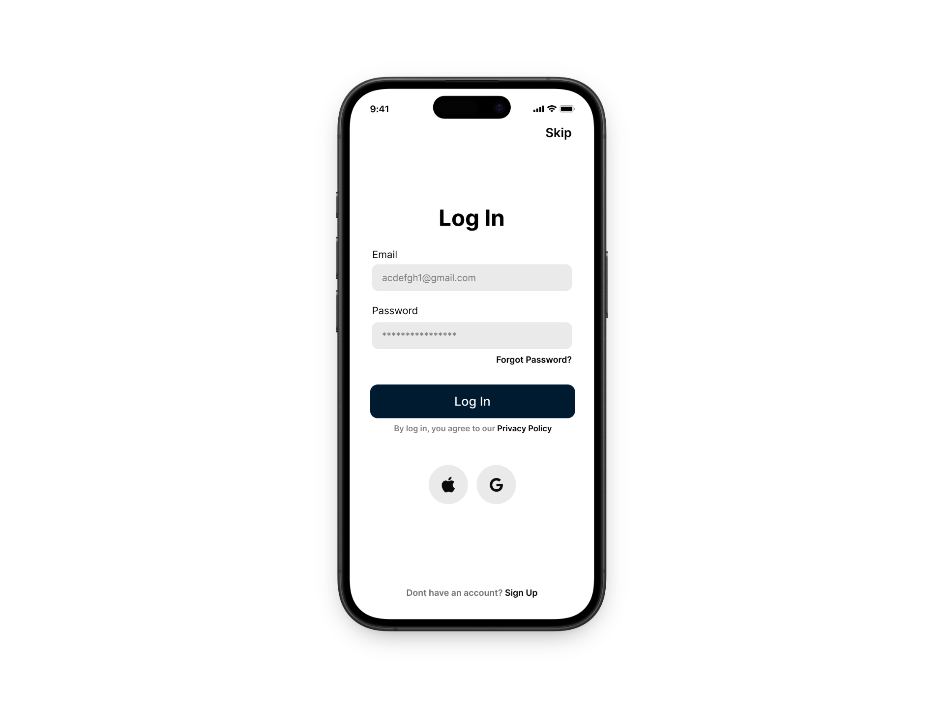
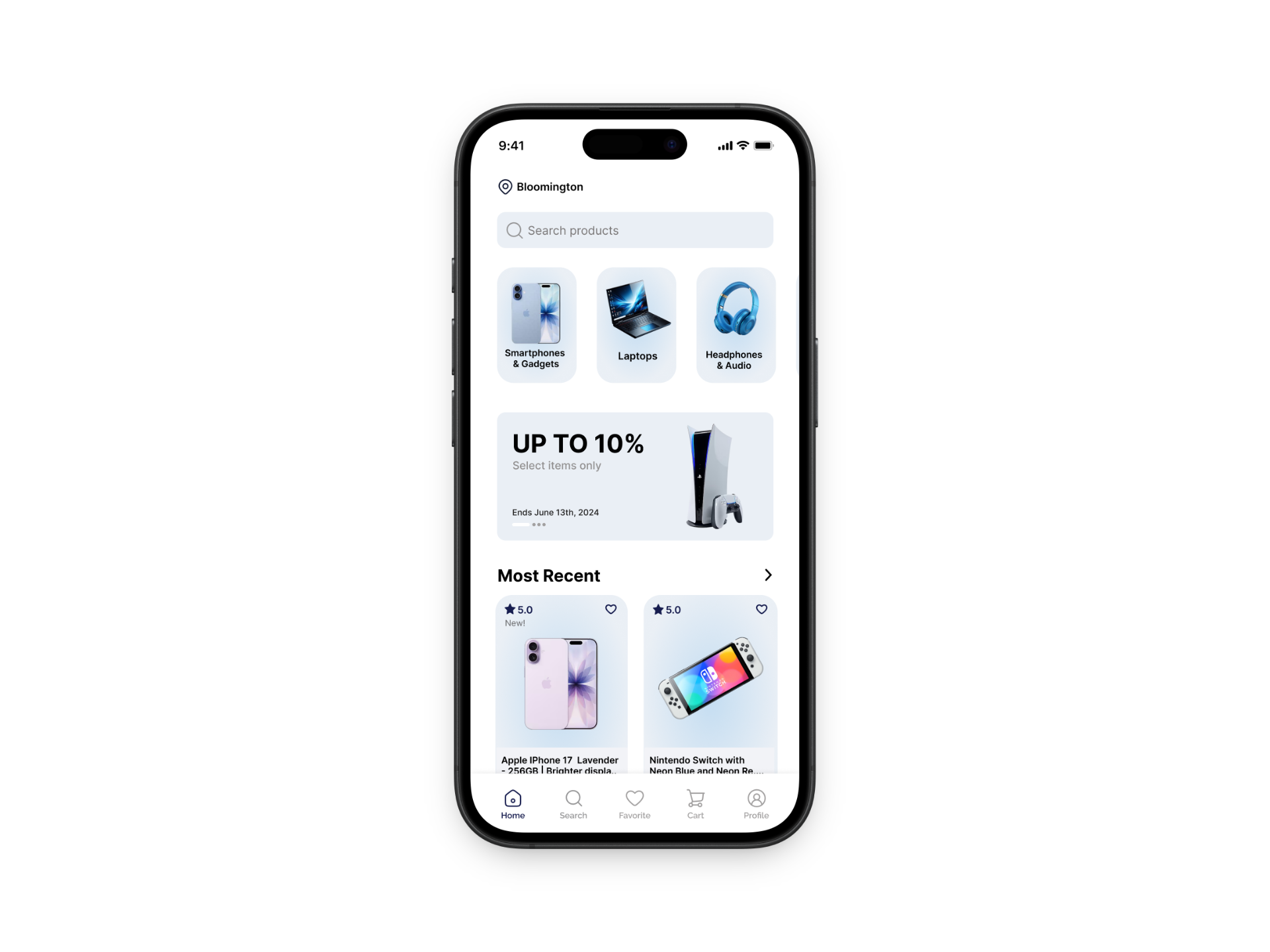
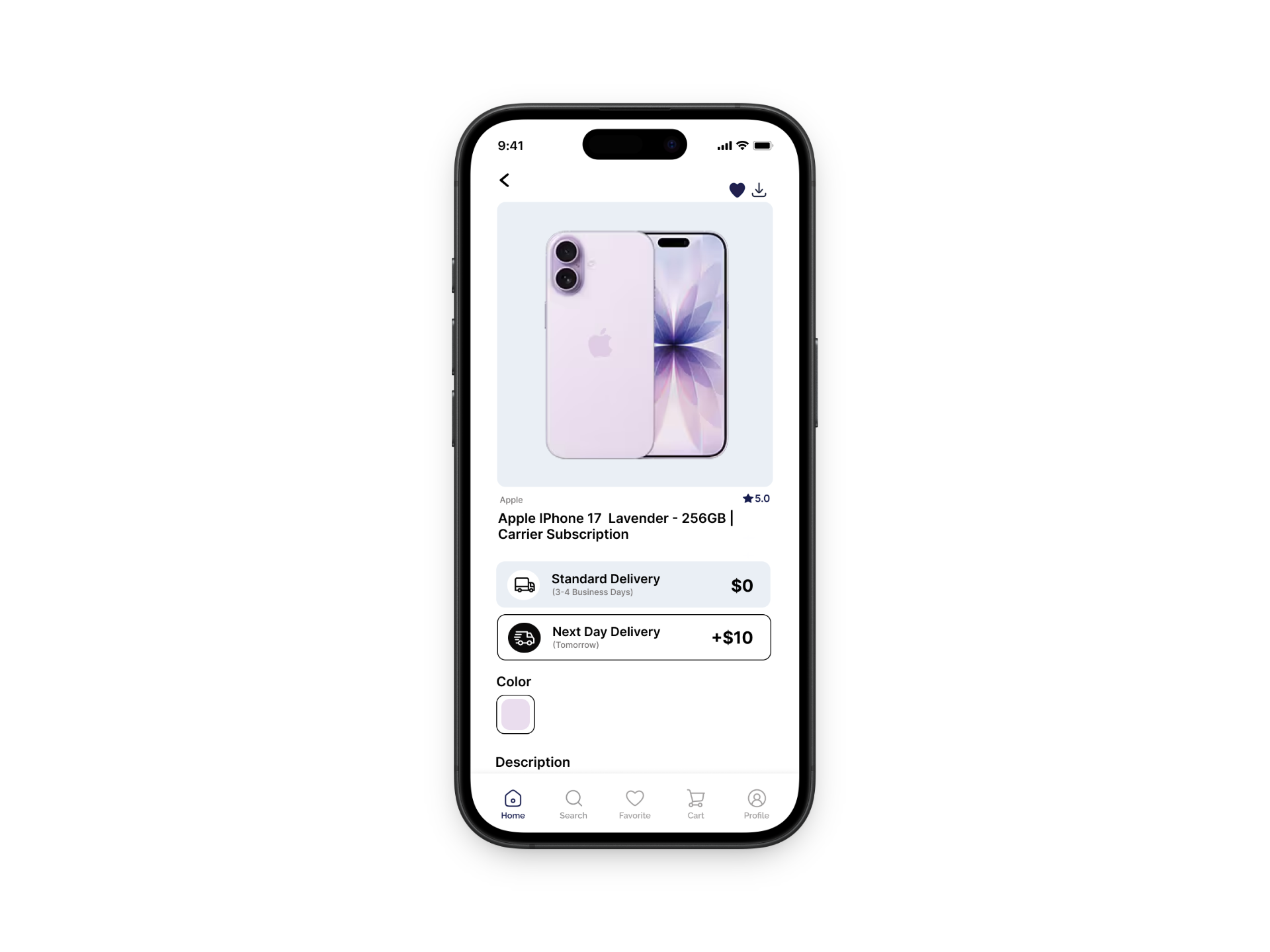
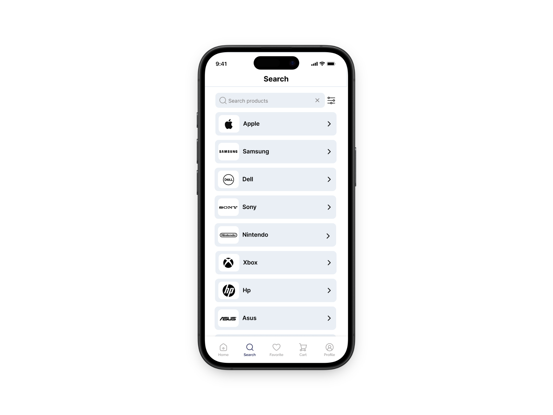
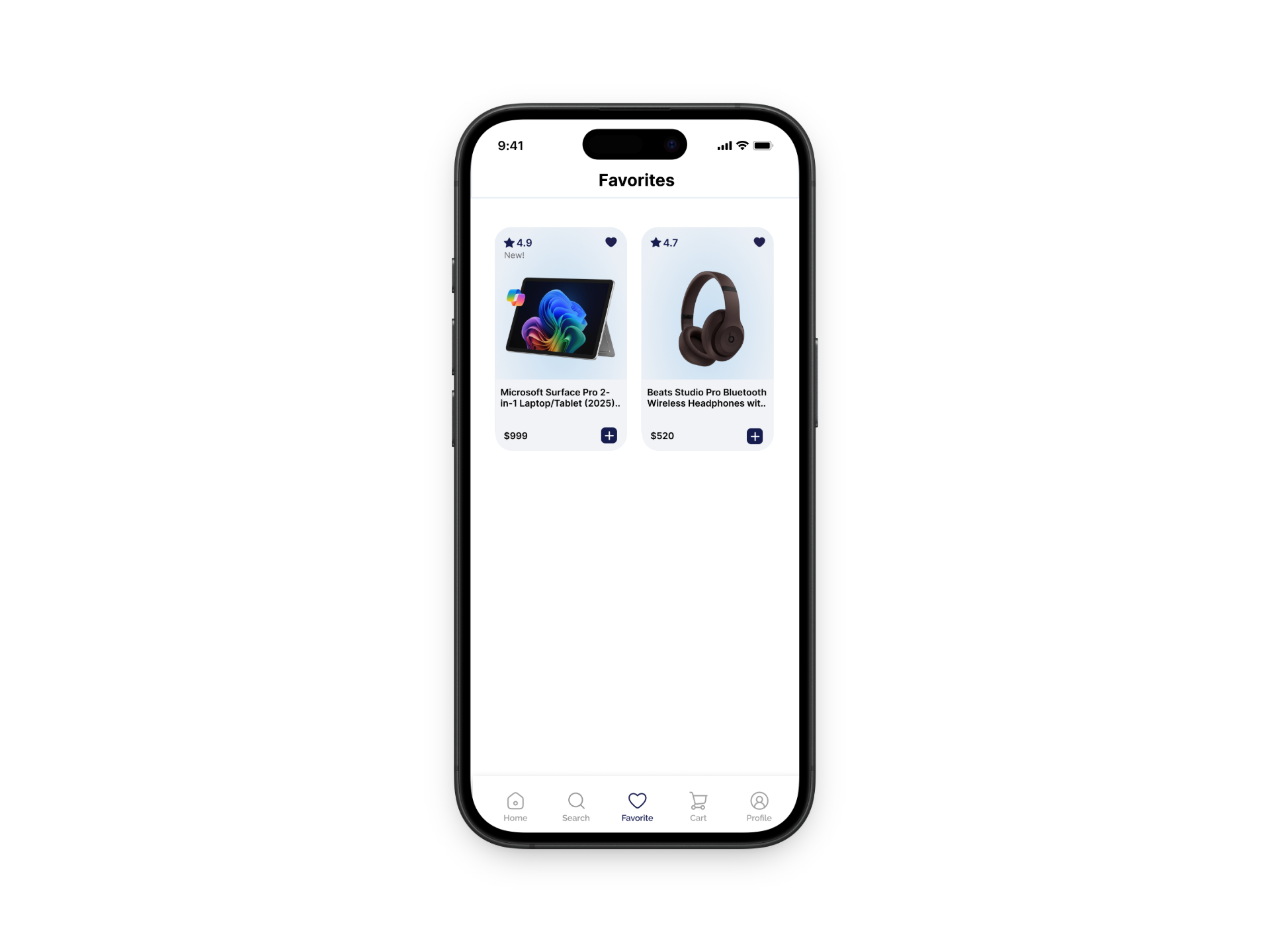
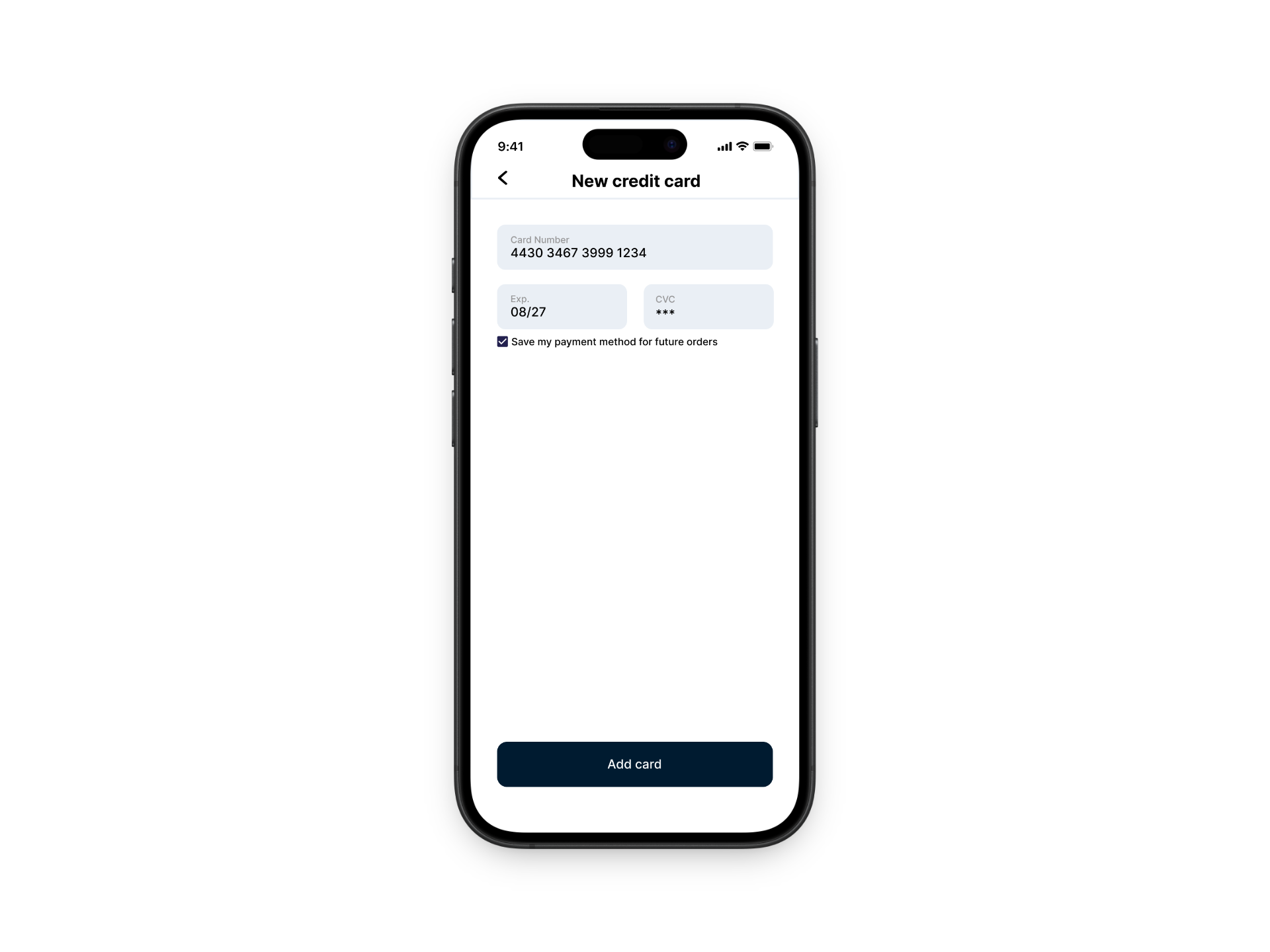
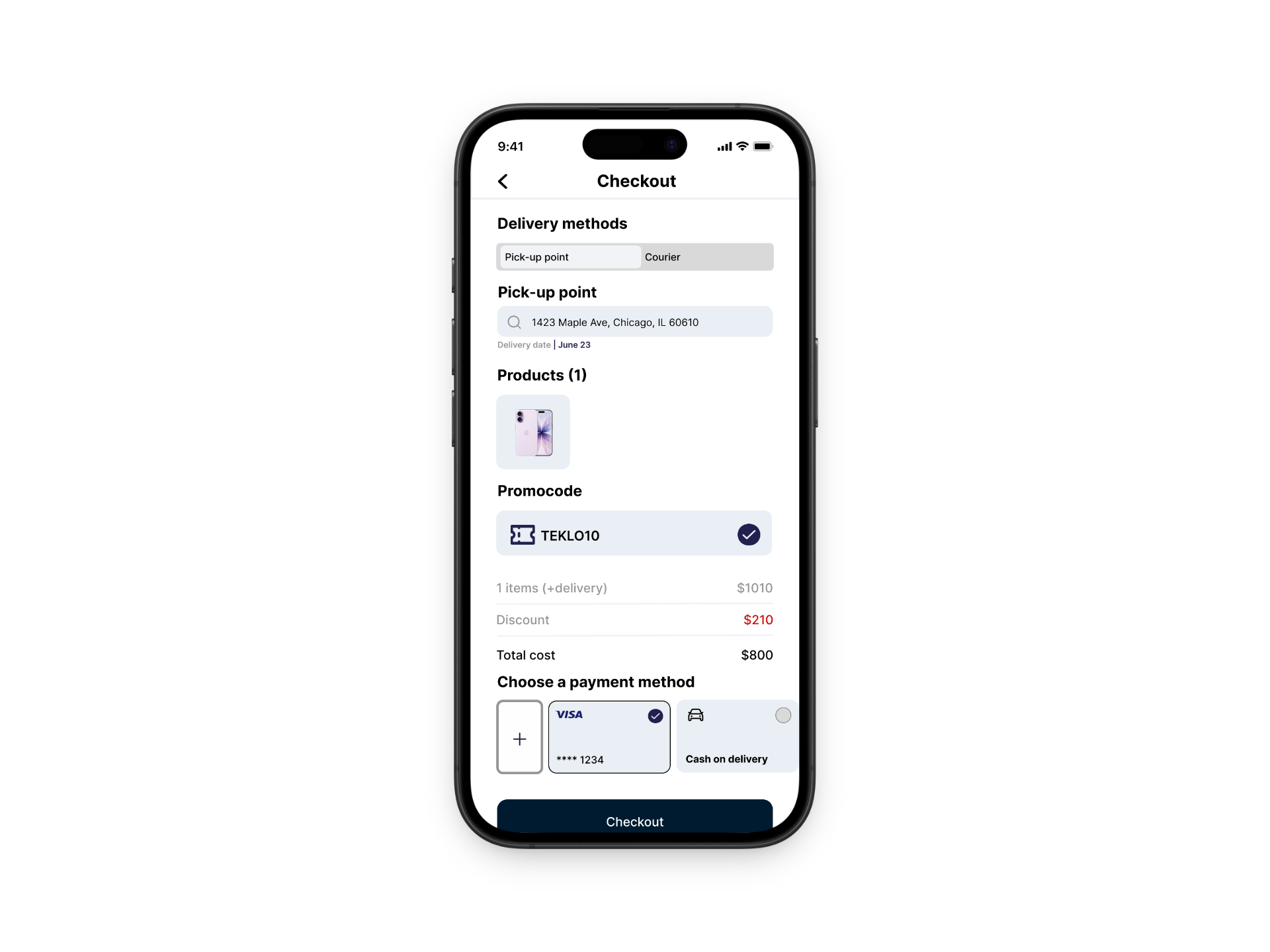
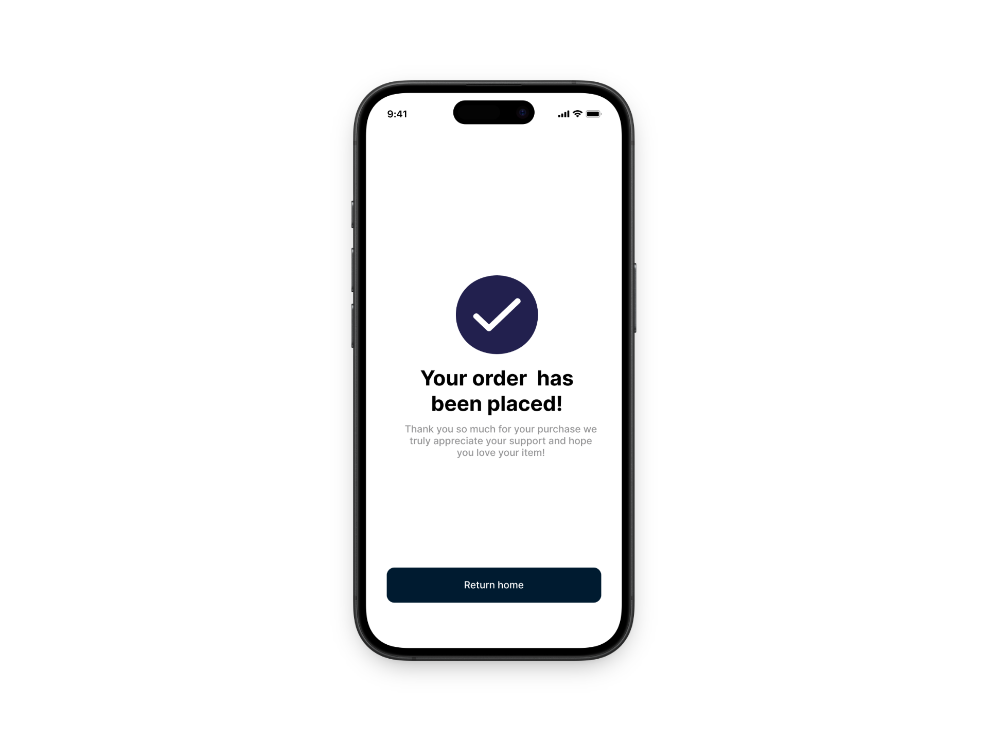
High Fidelity Prototype
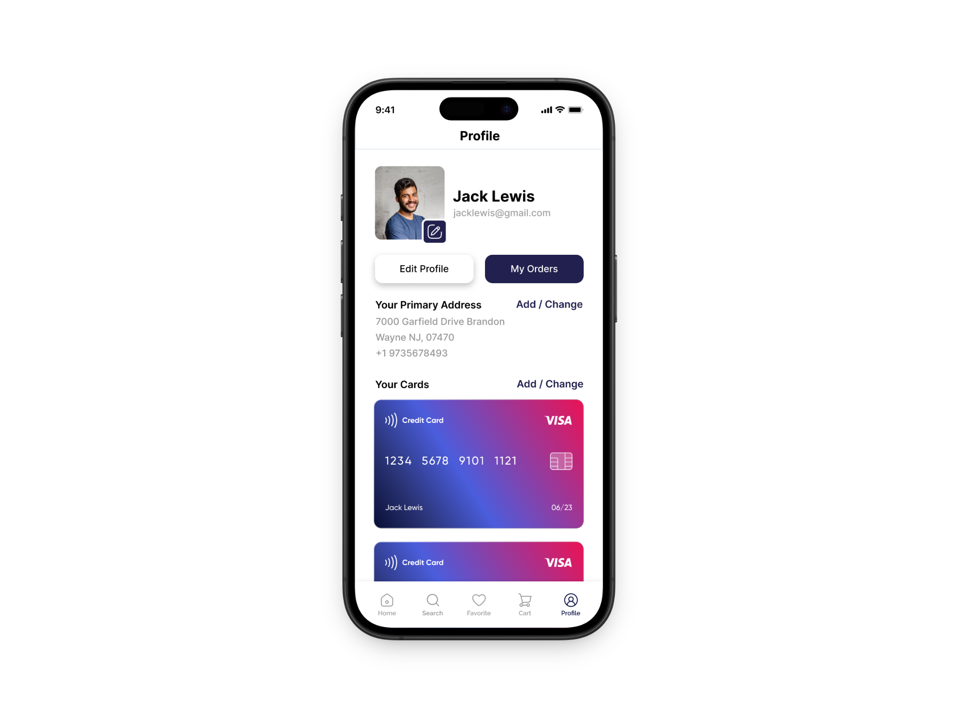
After developing initial concepts and wireframes, I created a high-fidelity prototype in Figma to bring the Teklo experience to life. This stage focused on refining the visual design, layout, and interactions to create a clean and intuitive interface that feels like a real marketplace app. I paid close attention to details like typography, spacing, and consistent UI components to ensure the design felt polished and easy to navigate.
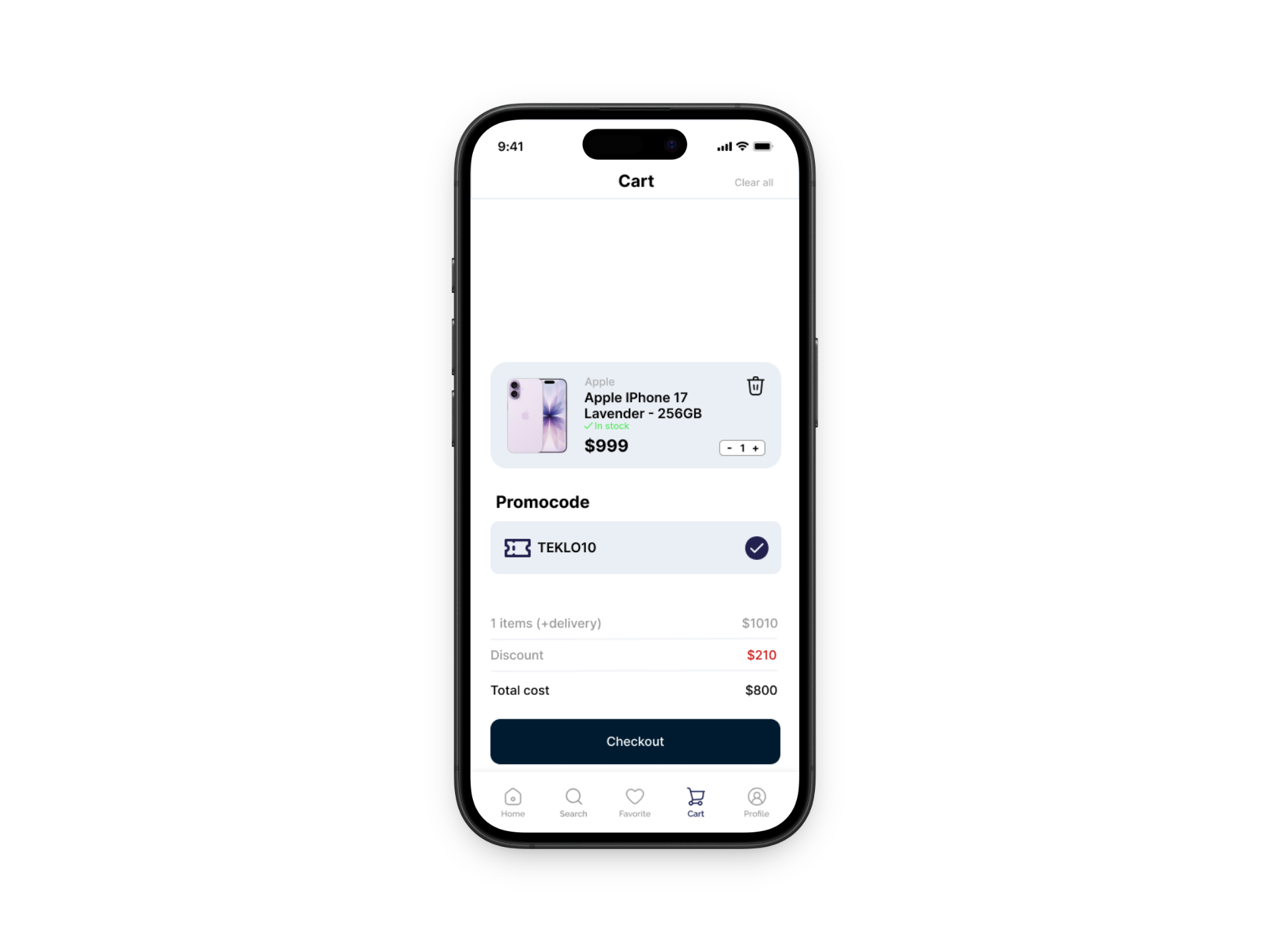
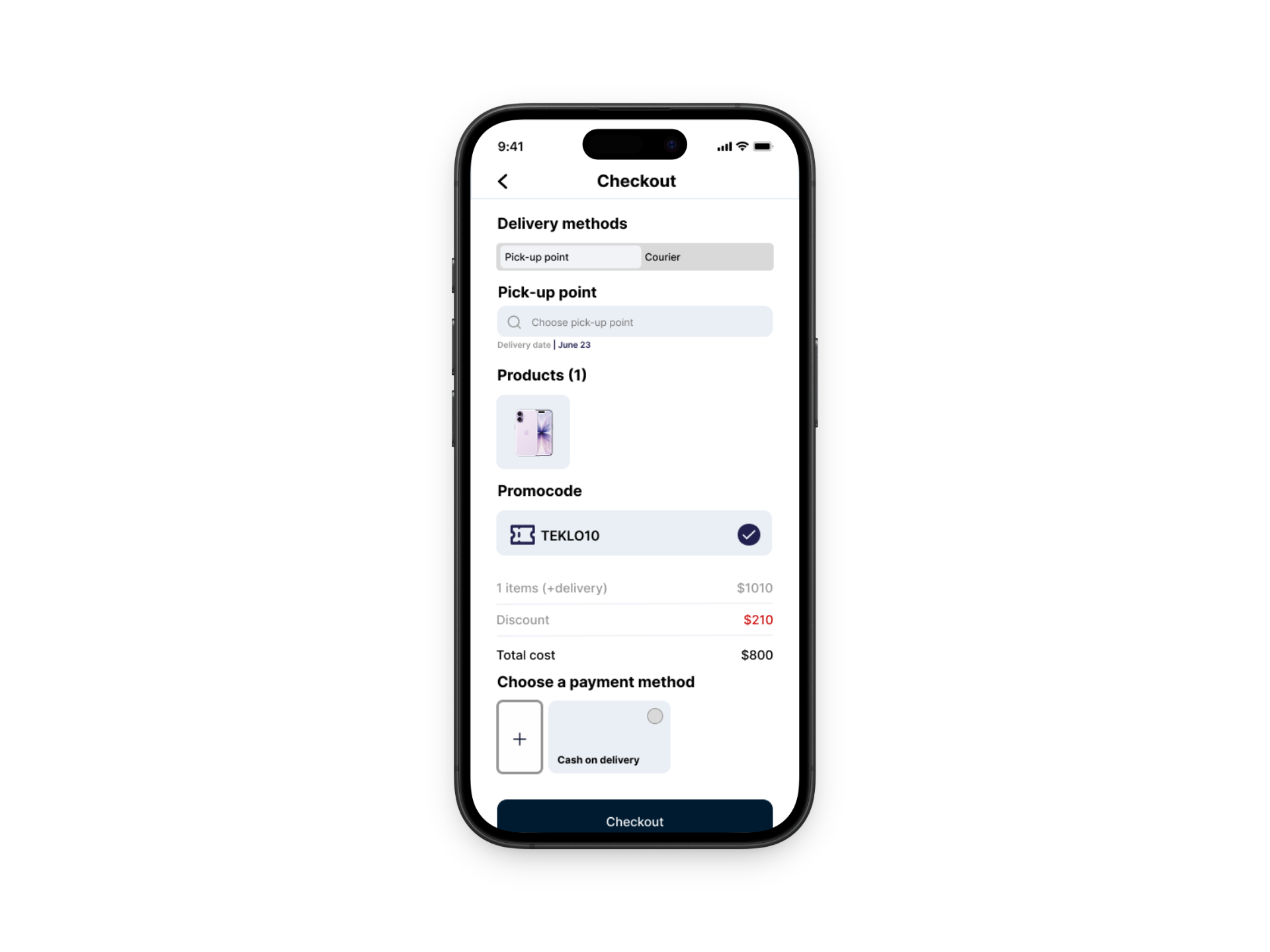
The prototype highlights key features such as searching for products, favoriting items, adding products to the cart, and completing a purchase. I focused on making the buying process as simple and seamless as possible, allowing users to quickly move from browsing to checkout without confusion. This high-fidelity version helped me clearly communicate the end-to-end user experience and demonstrate how Teklo supports a smooth and accessible purchasing journey.
REFLECTION
Working on Teklo helped me better understand how important simplicity and clarity are in UX design. From the beginning, I focused on creating an experience that felt easy to navigate, especially for users who may already feel overwhelmed by the cost and variety of technology. This pushed me to think more intentionally about user flows, making sure actions like searching, browsing, and saving items felt quick and intuitive without unnecessary steps.
One of the biggest things I learned was how much research and iteration shape a design. Through interviews and organizing insights into affinity diagrams, I was able to identify key user needs like affordability, trust, and ease of use. These insights directly influenced my design decisions, such as prioritizing clear product information and a clean layout. I also learned that removing features—like shifting away from selling—can actually strengthen the overall experience by making the platform more focused.
From a UX standpoint, this project reinforced the idea that good design isn’t about adding more, but about making thoughtful decisions that reduce friction for the user. It also helped me grow more confident in my process, from early sketches and wireframes to building a high-fidelity prototype. Overall, Teklo taught me how to design with empathy and intention, while constantly refining based on user needs and feedback.