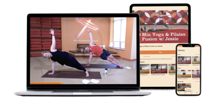
Dragonfly
A redesign of an existing hot yoga app focused on creating a more intuitive, personalized, and seamless booking experience
Challenge: The existing app made it difficult for users to quickly book classes and navigate the experience, especially when classes were full. The flow felt unclear and lacked personalization, which could lead to frustration.
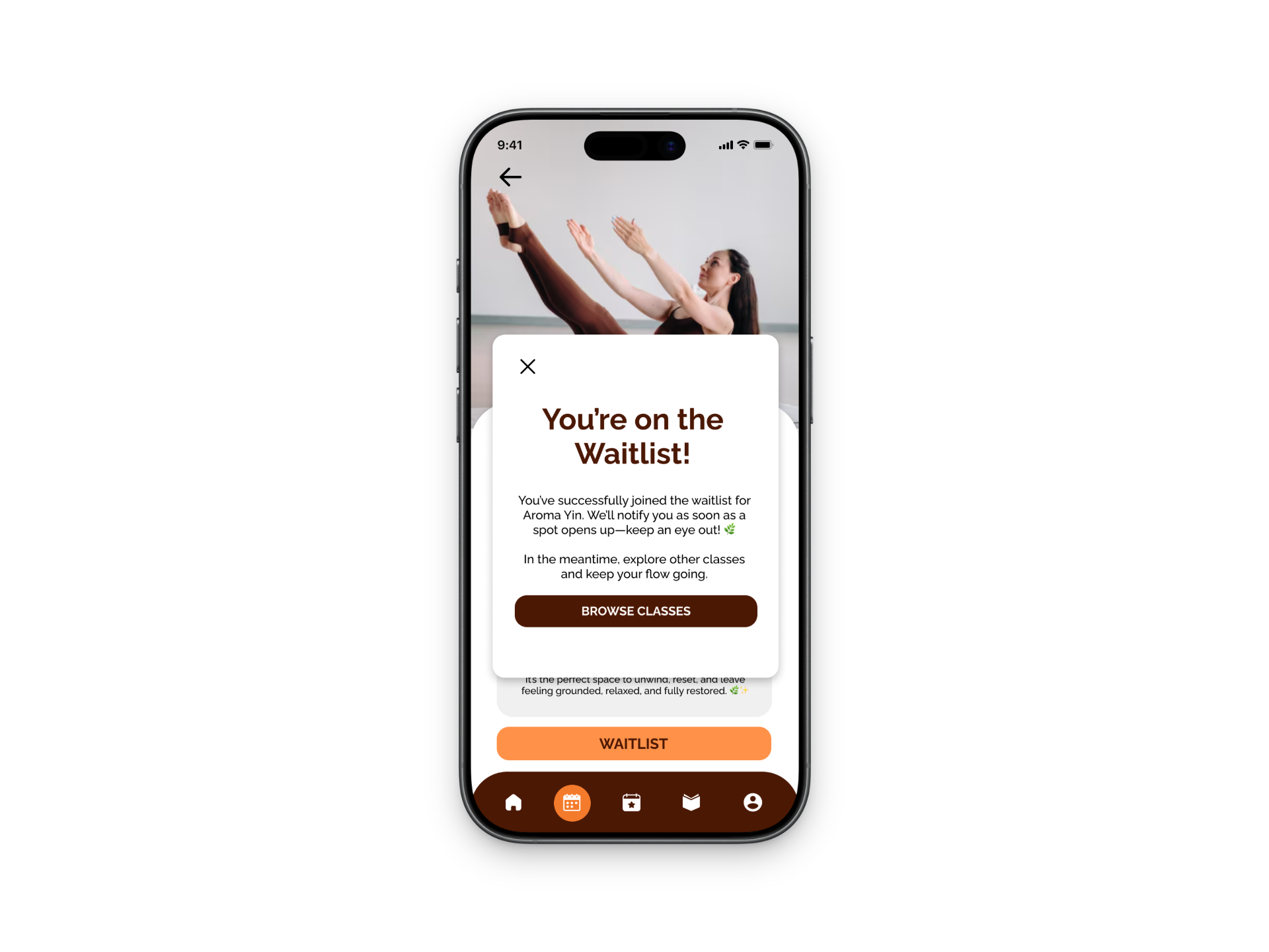
Solution: I redesigned the app to create a more intuitive, user-friendly flow by simplifying navigation, adding personalization through user preferences, and improving the booking experience. When classes are full, the app now offers a waitlist option with recommended alternative classes, helping users stay engaged and easily find another option
Deliverables: Sketches, User Flows, Low-Fidelity Wireframes, Iterations, UX Design Decisions, Prototype
Team:
Solo Project
Tools:
Figma, FigJam, Miro
Timeline:
January 2026 - Present
Role:
UX Designer, Product Designer
Overview
This project started in my User Experience II class as part of my master’s program and is still a work in progress. For the assignment, we were asked to choose a company in the Madison, Wisconsin area, and I chose Dragonfly Hot Yoga since I’m an active member and genuinely enjoy going to classes. Through using the app regularly, I noticed that the interface feels outdated and the booking experience isn’t as smooth or intuitive as it could be.
This redesign focuses on improving the overall user experience by making the app more modern, easy to navigate, and personalized. I specifically looked at how users book classes, set preferences, and handle situations like when a class is full. The goal was to simplify these flows and reduce friction, while also creating a more engaging and supportive experience for users. Since this is still an ongoing project, I plan to continue refining the design and eventually move into higher-fidelity prototypes and testing.
The Problem
The app interface feels outdated and not very user-friendly
Booking a class is more complicated than it should be
Important information is not clearly organized or easy to find
The app lacks personalization (no easy way to set preferences for classes or instructors)
When classes are full, the experience feels like a dead end
Users are not guided toward alternative options or next steps
How Might We Statement…
How might we help Dragonfly Hot Yoga members and newcomers easily explore, book, and manage classes so they feel motivated to maintain a consistent yoga practice and fully enjoy their studio experience?
Key Insights
Quick Access to Class Information
Users want to quickly see class schedules, availability, and instructor info on their phones.
Confusing Booking Experience
Booking, cancellations, and class reminders can be confusing or inconvenient with the current system.
Onboarding for New Members
New members need an easy way to explore class types, membership options, and beginner-friendly sessions.
Early Ideation
I started by reviewing my research and identified that a key challenge for Dragonfly users is easily finding, booking, and managing classes. During brainstorming in FigJam, I focused on generating a wide range of ideas without judging them, using techniques like adding and removing constraints to explore different possibilities. As ideas developed, I grouped them into themes like scheduling, personalization, and new member support, which helped me combine concepts into stronger solutions like the “Suggested for You” feed.
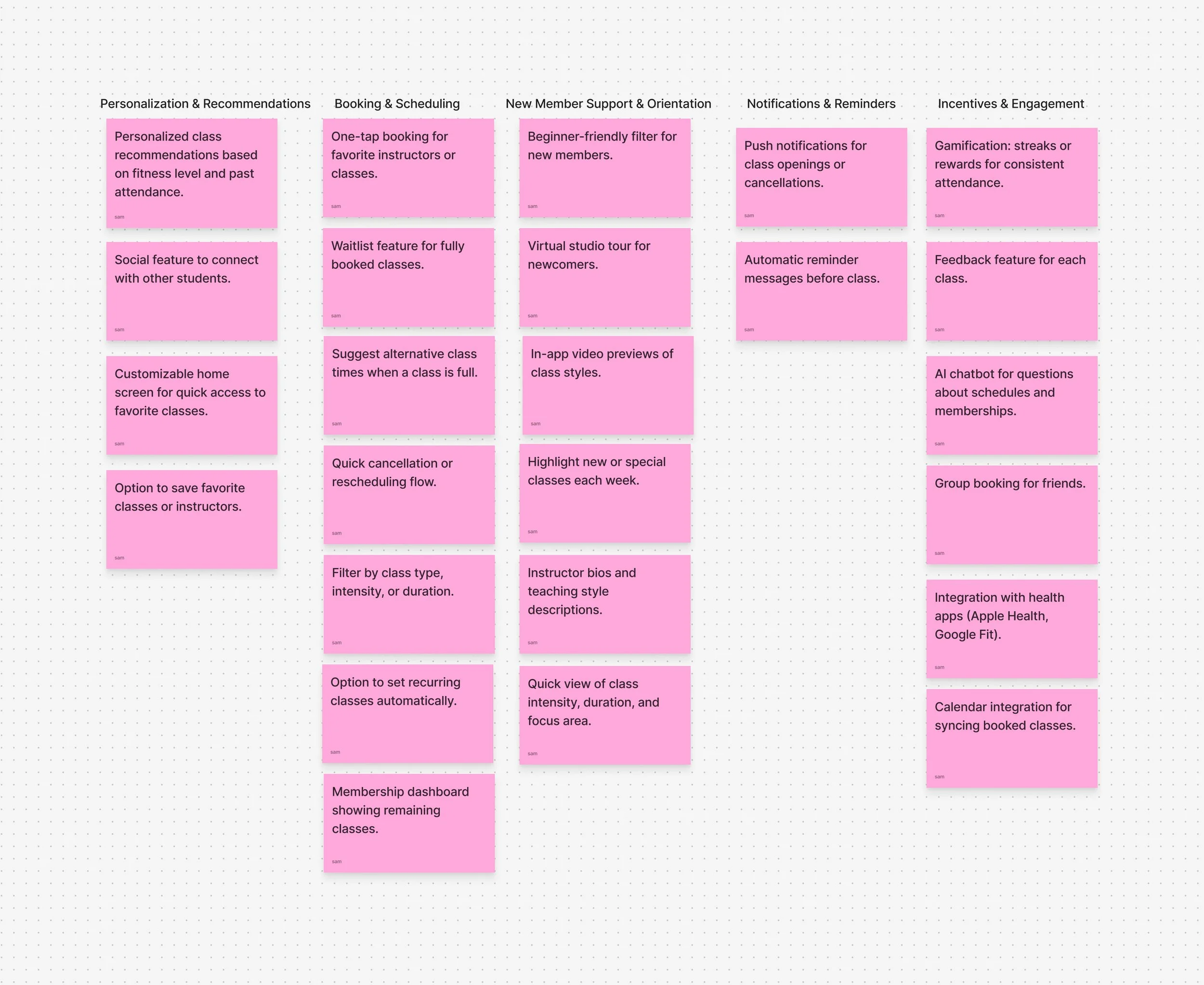
Concept Explorations
1. Suggested for You Feed
A personalized feed that recommends classes based on user preferences, attendance history, and experience level. Helps both new and returning users quickly find relevant classes.
2. Smart Scheduler
A feature that suggests and organizes classes based on availability and user habits, including reminders, recurring bookings, and alternative recommendations when classes are full.
3. Yoga Challenges with Friends
A social feature that allows users to participate in challenges, track progress, and stay motivated through community engagement and rewards.
Storyboard
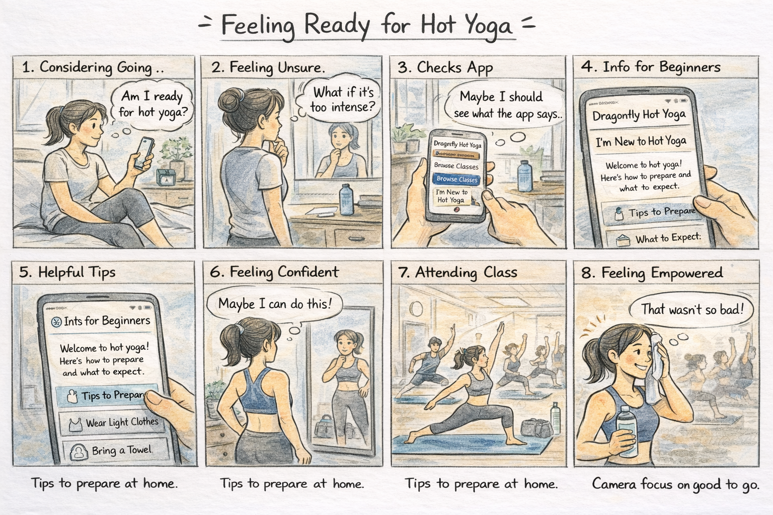
Procreate sketch showing a personalized class recommendation feed that helps users easily discover, explore, and book yoga classes based on their preferences.
I started this storyboard by focusing on a key problem: users often feel unsure or intimidated before attending a hot yoga class. Instead of jumping straight into sketching, I first mapped out the user’s experience step-by-step to create a clear story with a beginning, middle, and end.
One important decision I made was to show the user’s real-life context before introducing the app. I wanted to highlight that the challenge starts before booking a class, it's about deciding whether to go at all.
Through this process, I learned that good UX design isn’t just about features, it’s about understanding how users feel and designing experiences that support them.
Taskflows
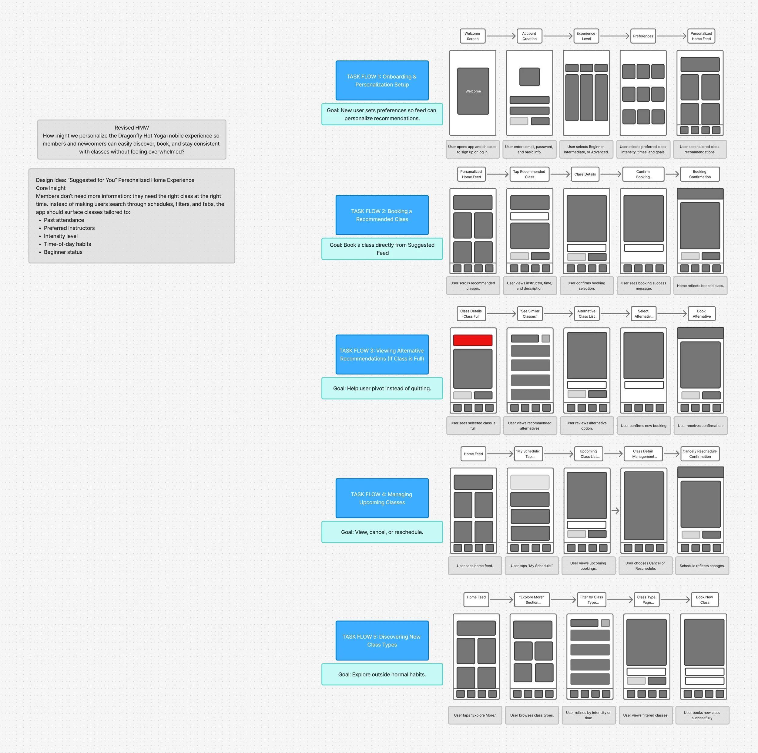
I focused on narrowing my concept down to one main feature: a “Suggested for You” personalized home feed for the Dragonfly Hot Yoga app. While I initially explored multiple ideas, I chose personalization because it directly addresses users feeling overwhelmed when trying to find and book classes.
I refined my approach by identifying five key user tasks, including onboarding, booking a recommended class, handling full classes, managing bookings, and exploring new options. I designed each task flow to be simple and linear, applying the concept of reducing cognitive load so users can easily understand what to do next.
Sketch of my five task flows in FigJam showing the linear arrows between screens and rough grey box layouts for each step before creating digital versions.
I created sketches for three key task flows in the Dragonfly Hot Yoga app: setting preferences, booking a class, and handling full classes. Before sketching, I revisited my problem to stay focused on making the experience simple, personalized, and stress-free.
Below are rough sketches showing three different task flows:
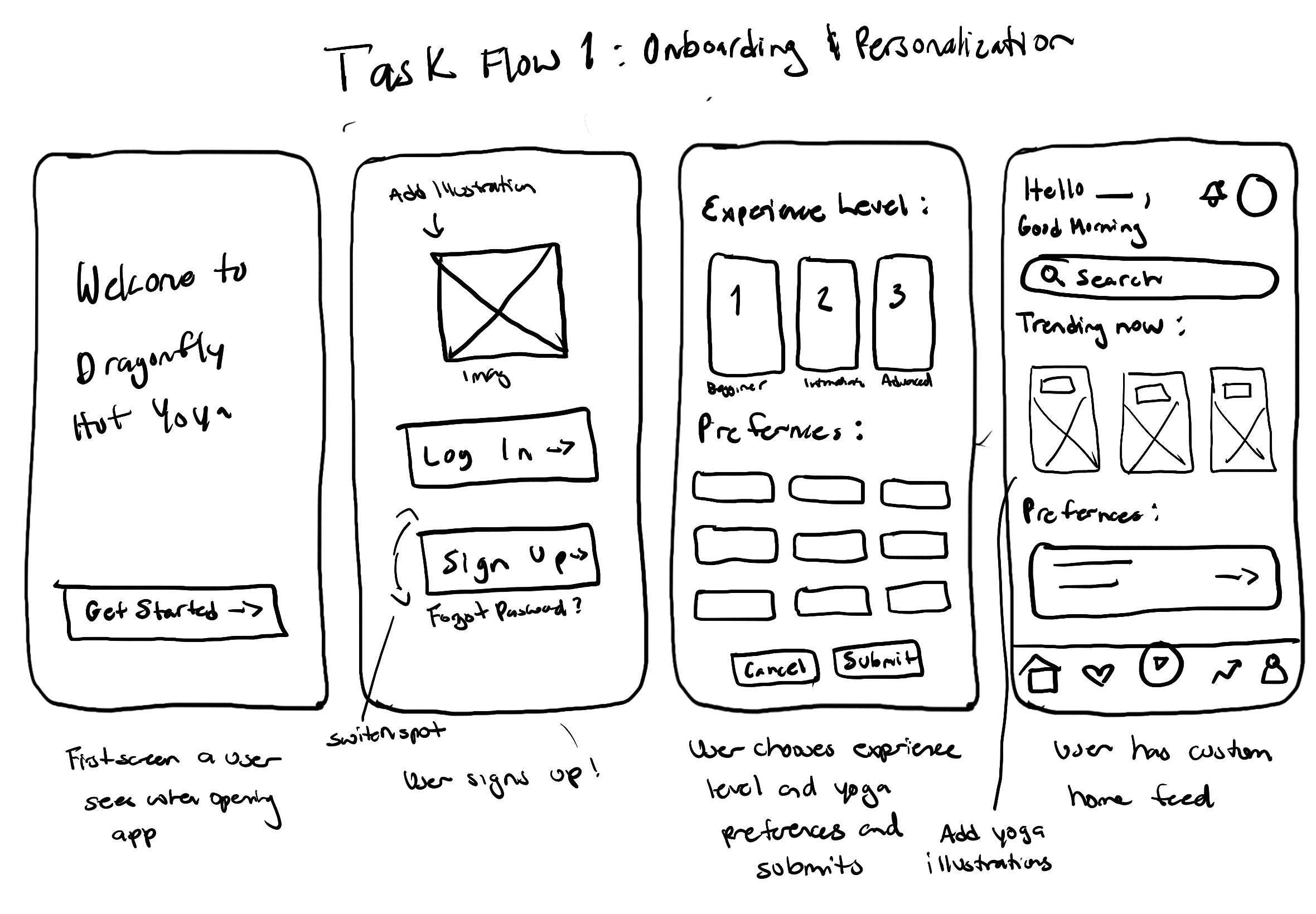
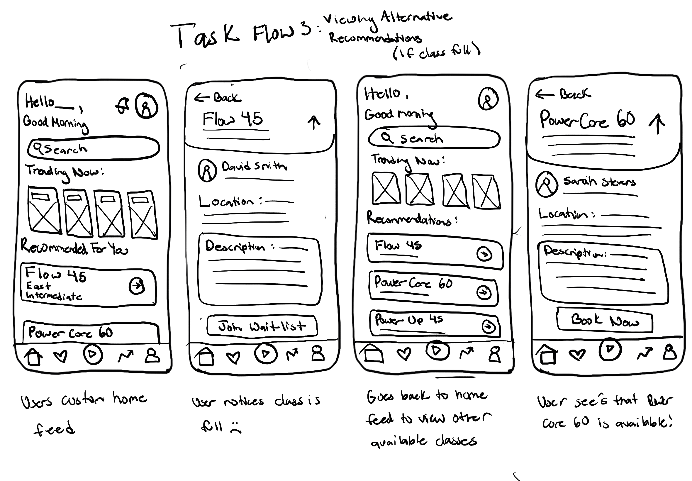
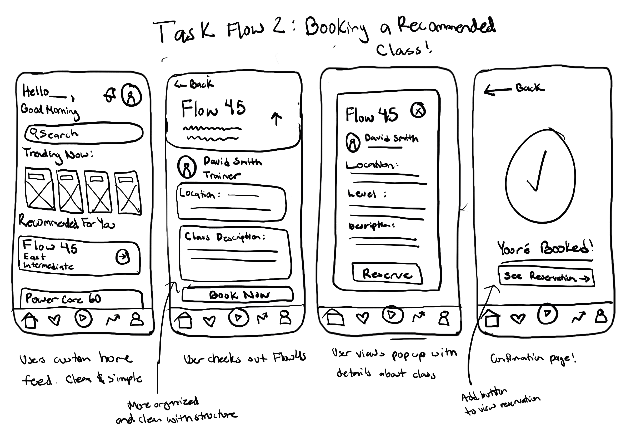
Throughout the process, I prioritized clarity and consistency by repeating familiar layouts, button styles, and interaction patterns across screens. This helped create a more intuitive experience while also making it easier to test and adjust flows as I gathered feedback. By staying flexible and focusing on structure first, I was able to build a strong foundation before moving into higher-fidelity design decisions.
Screen Sketches
Wireframes
Creating wireframes was an important step in turning my initial ideas into more structured layouts. It helped me define the information hierarchy, user flow, and main interactions early on so the experience felt intuitive and aligned with user needs.
By working in low-fidelity, I was able to focus more on usability and functionality instead of getting distracted by visual design. This made it easier to quickly iterate, test different layout options, and catch any issues early. It also helped me build consistency across screens, especially for navigation and key actions like browsing and booking.
Overall, wireframing helped me create a strong foundation for the app and made the transition into high-fidelity designs much smoother and more intentional.
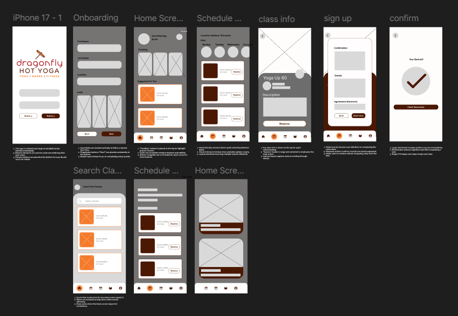
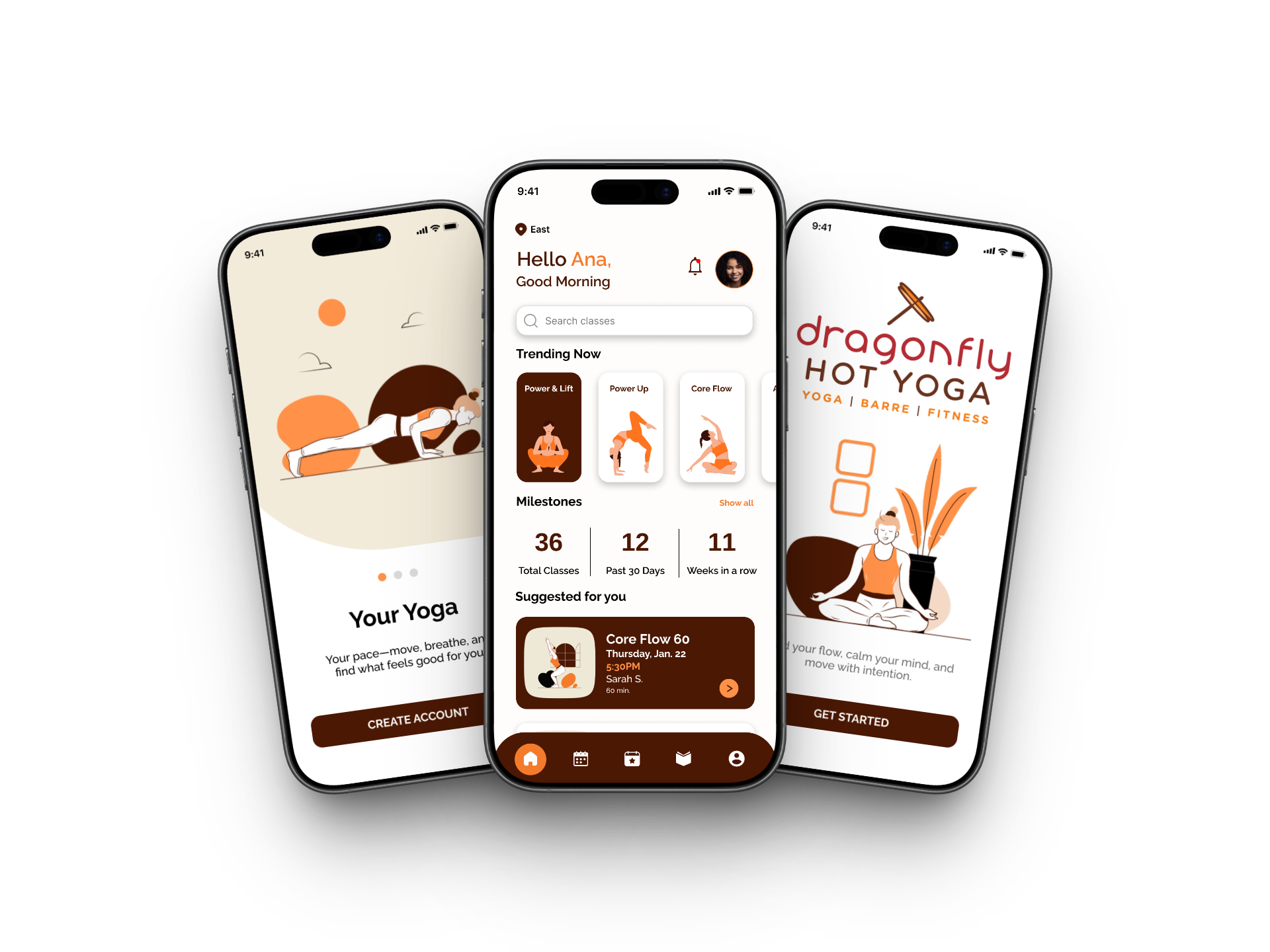
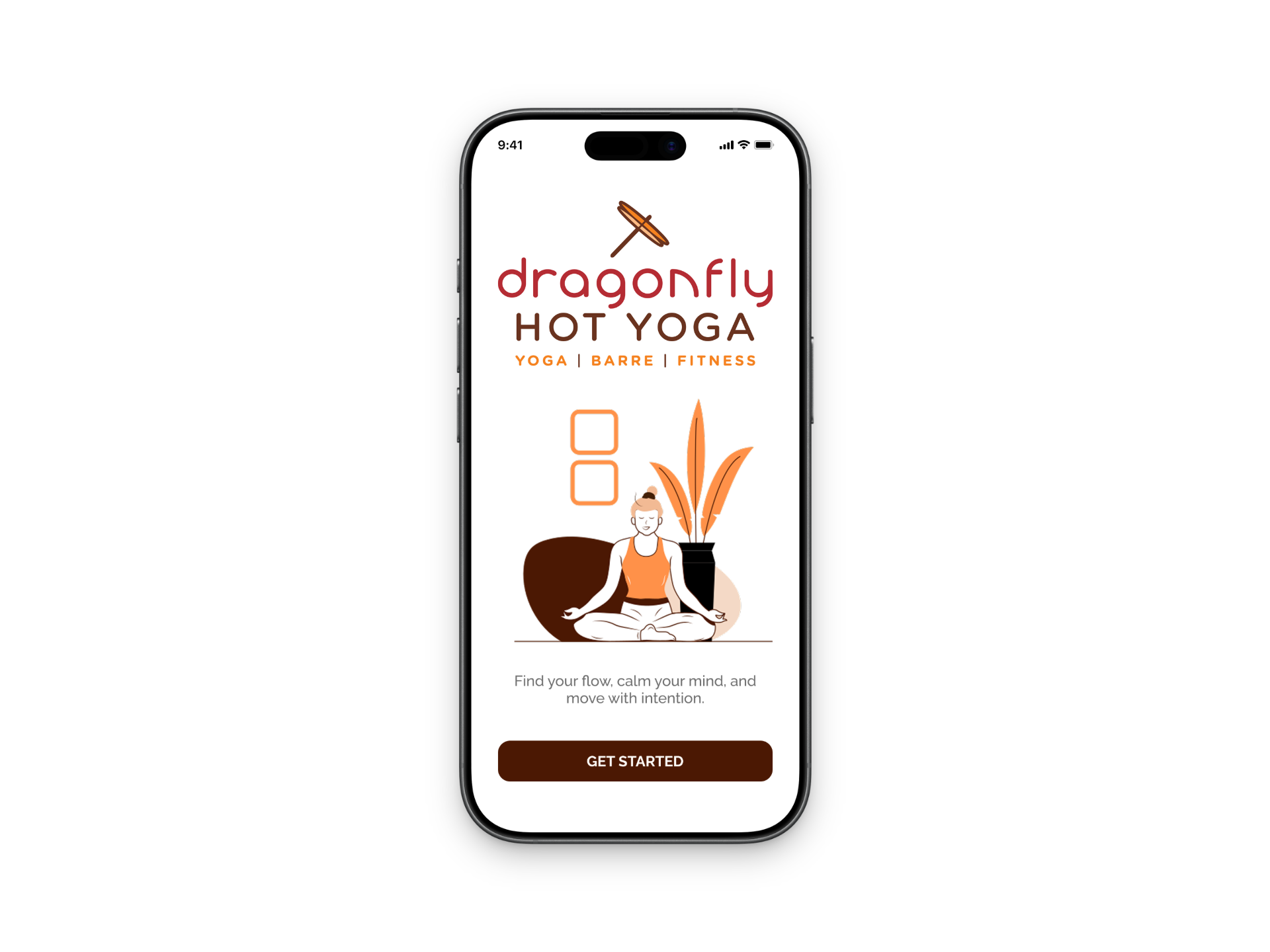
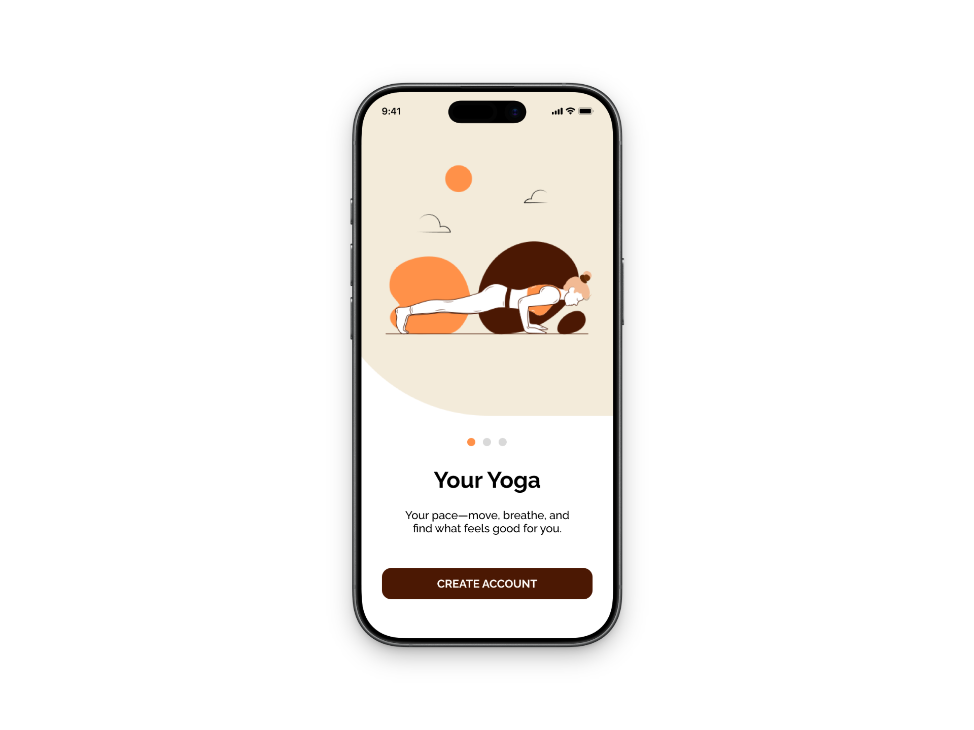
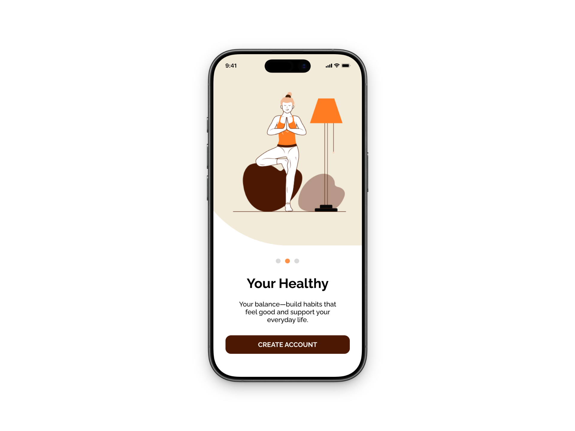
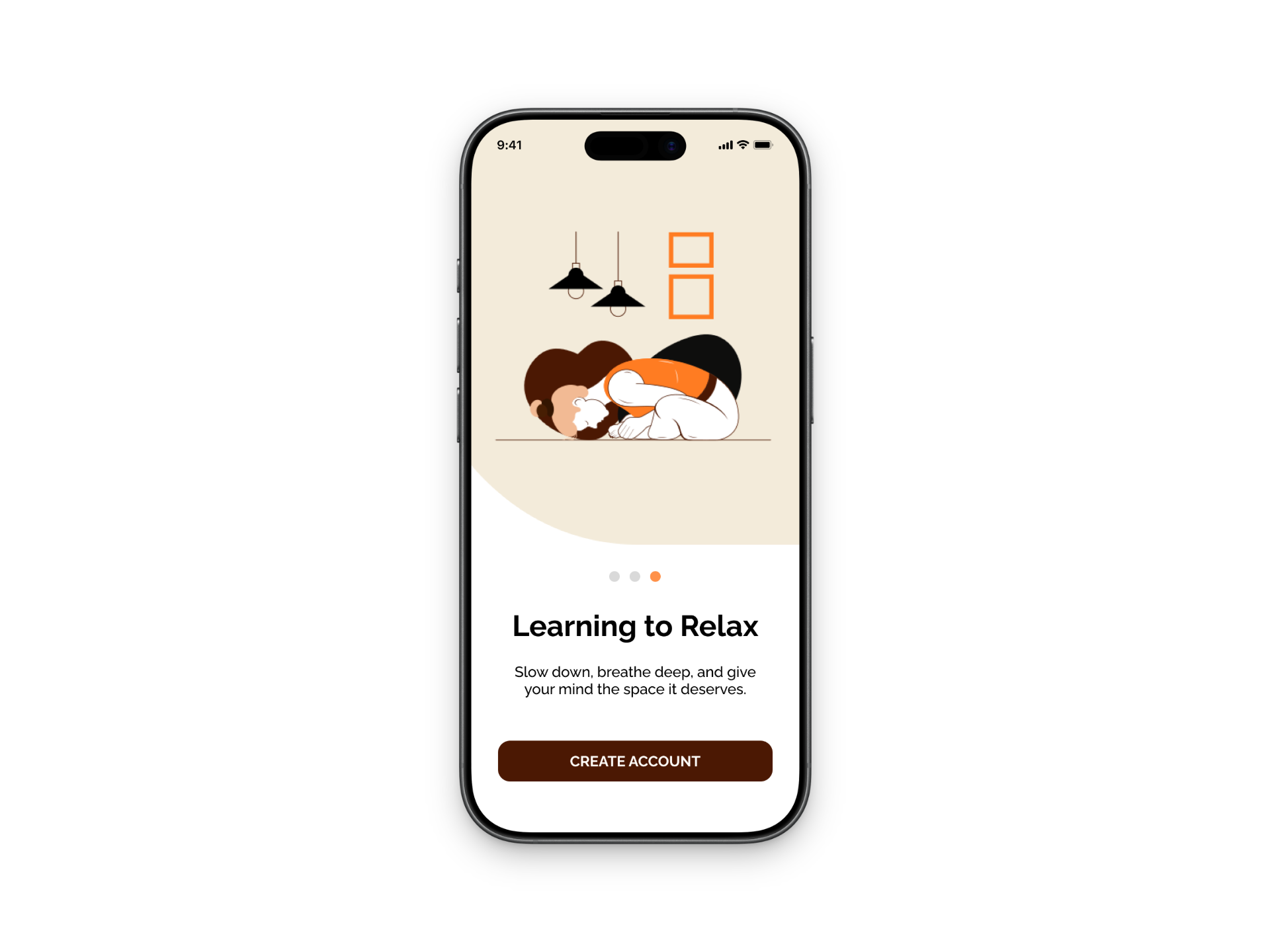
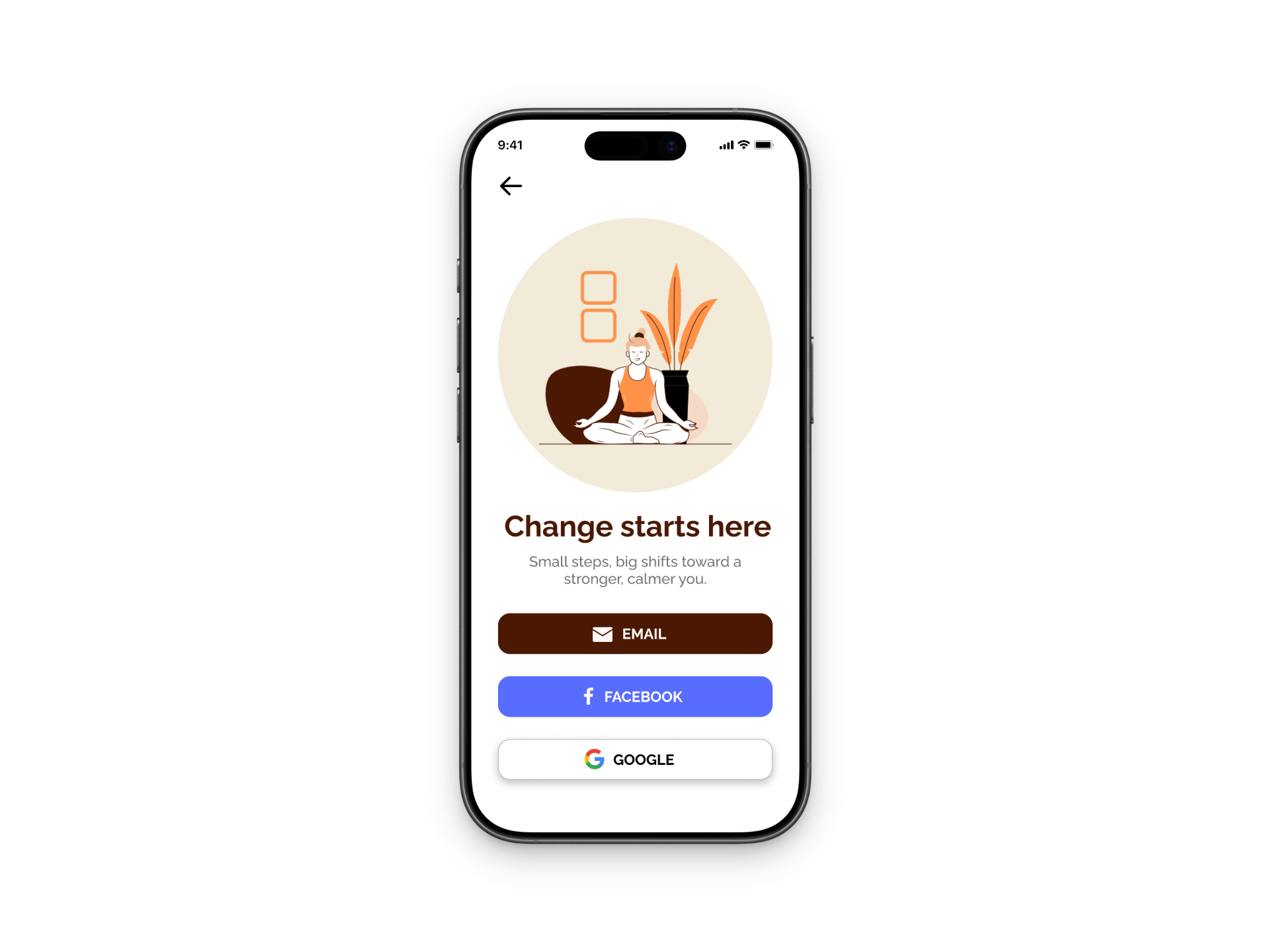
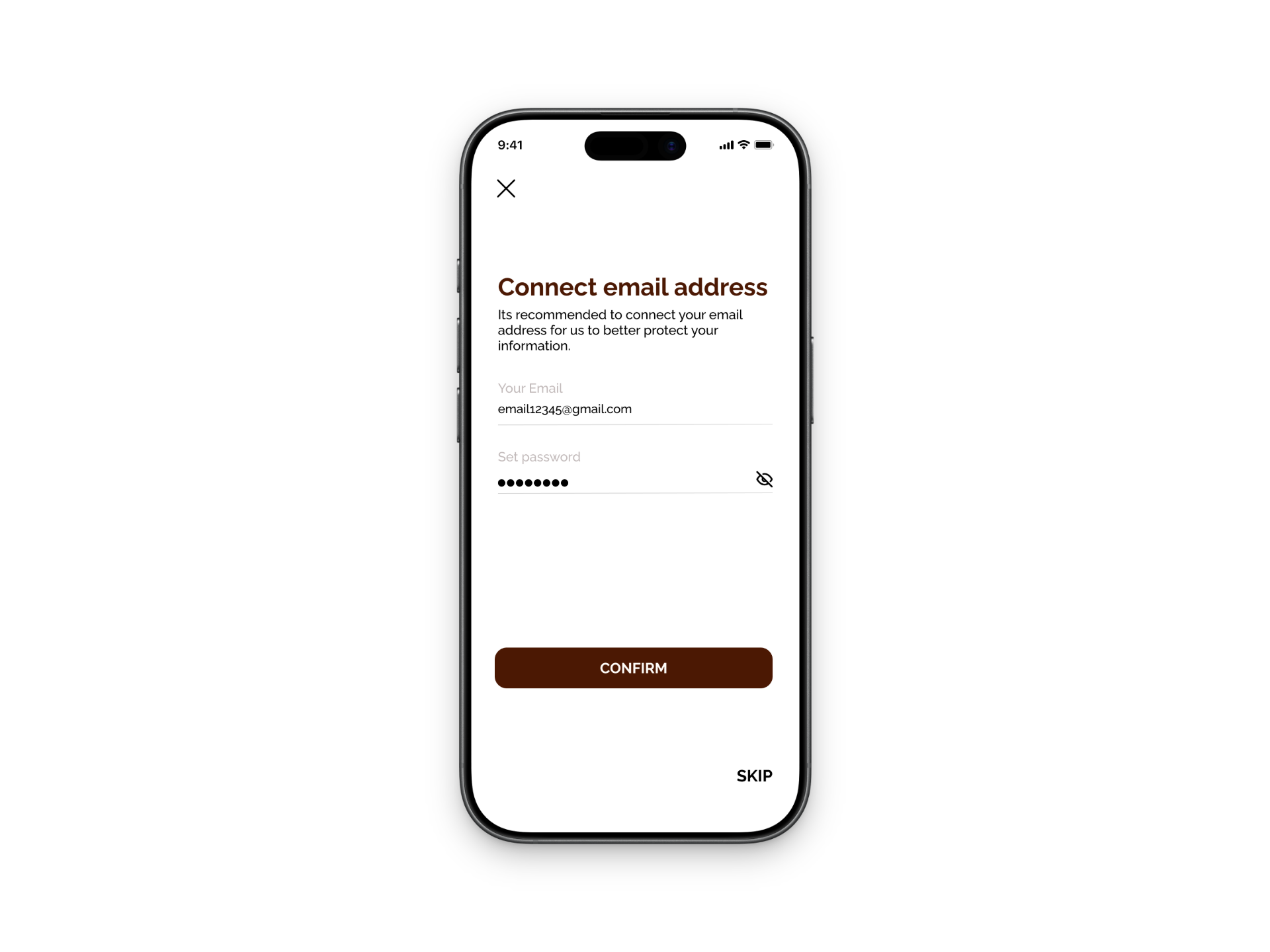
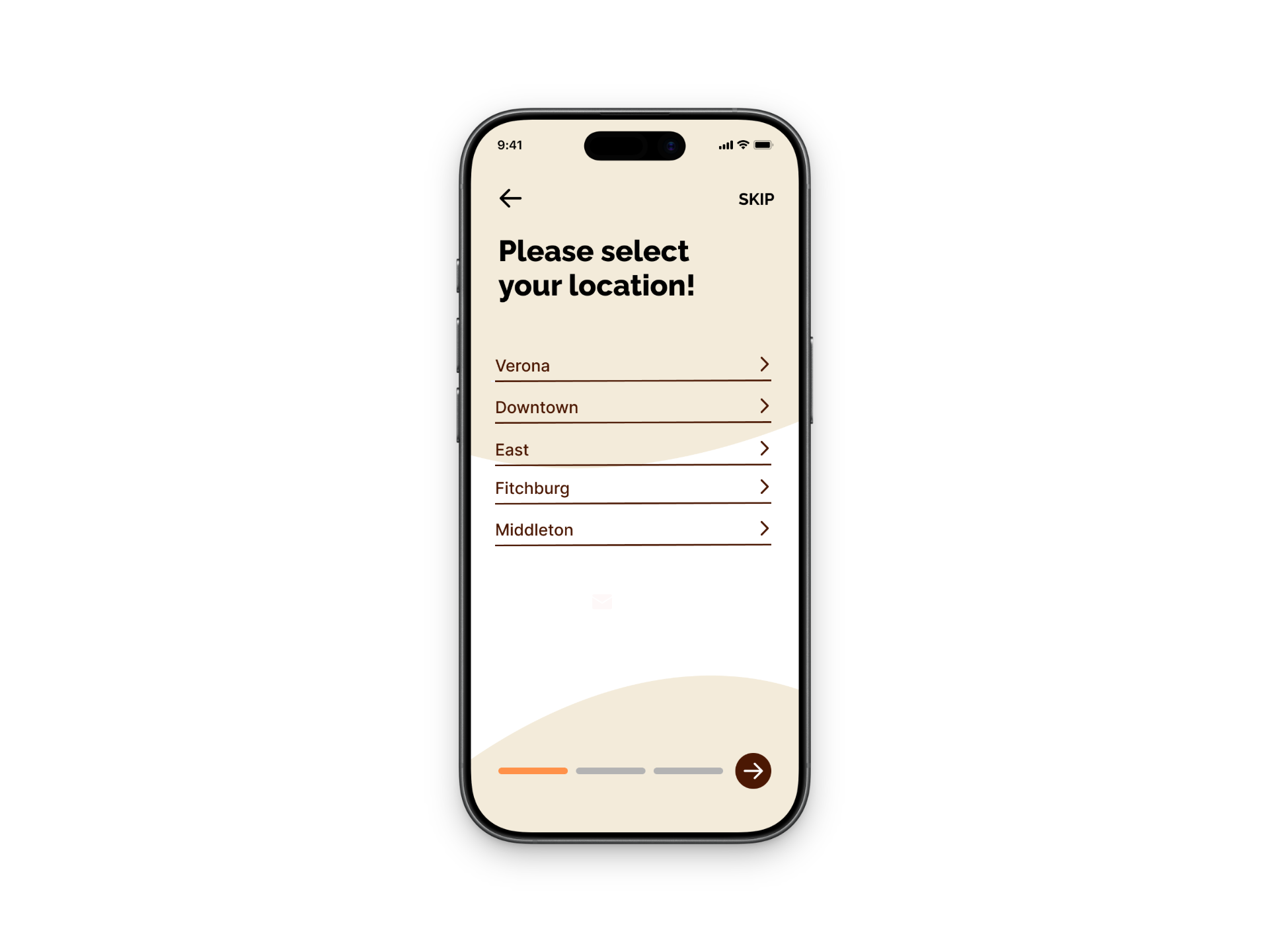
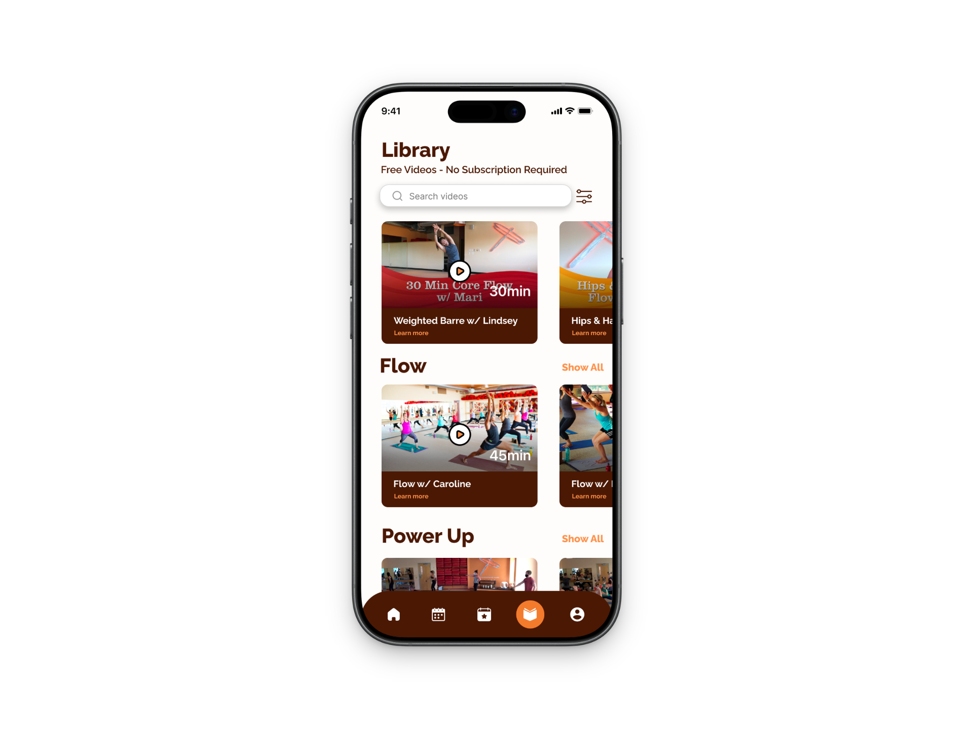
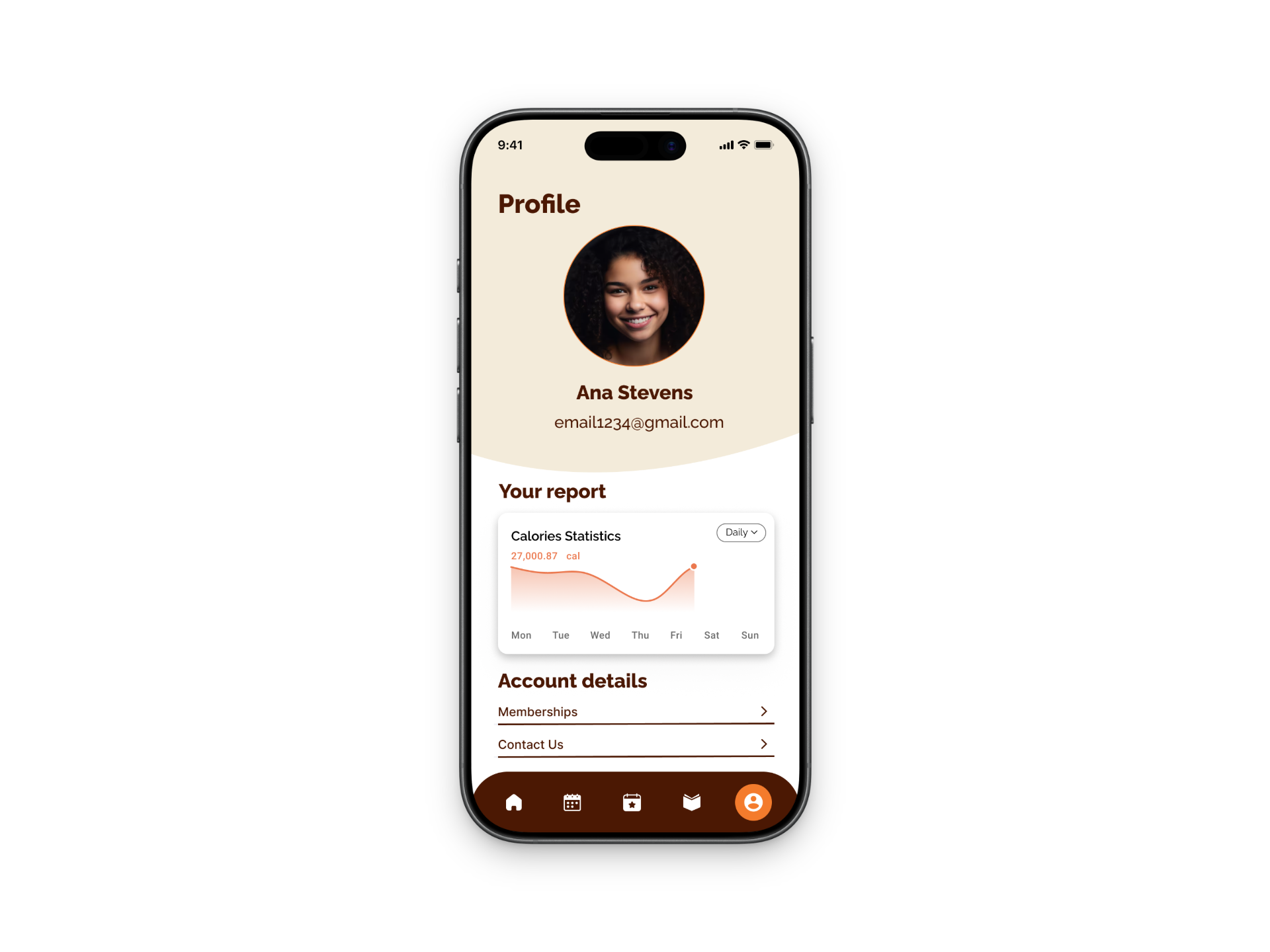
High-Fidelity Prototype
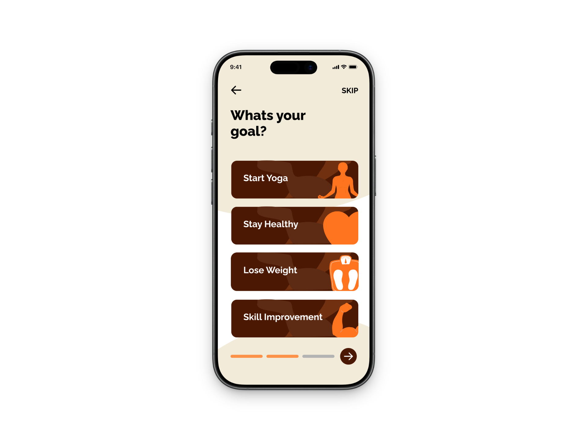
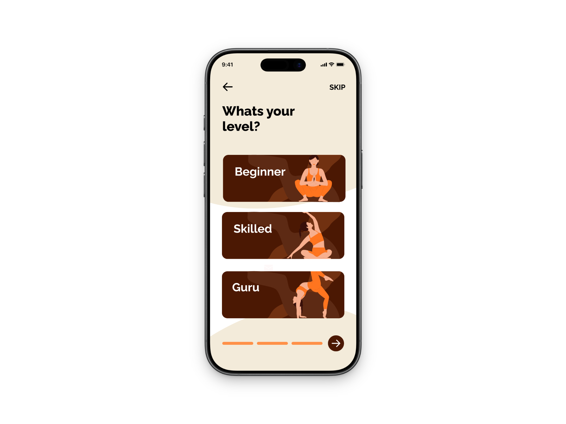
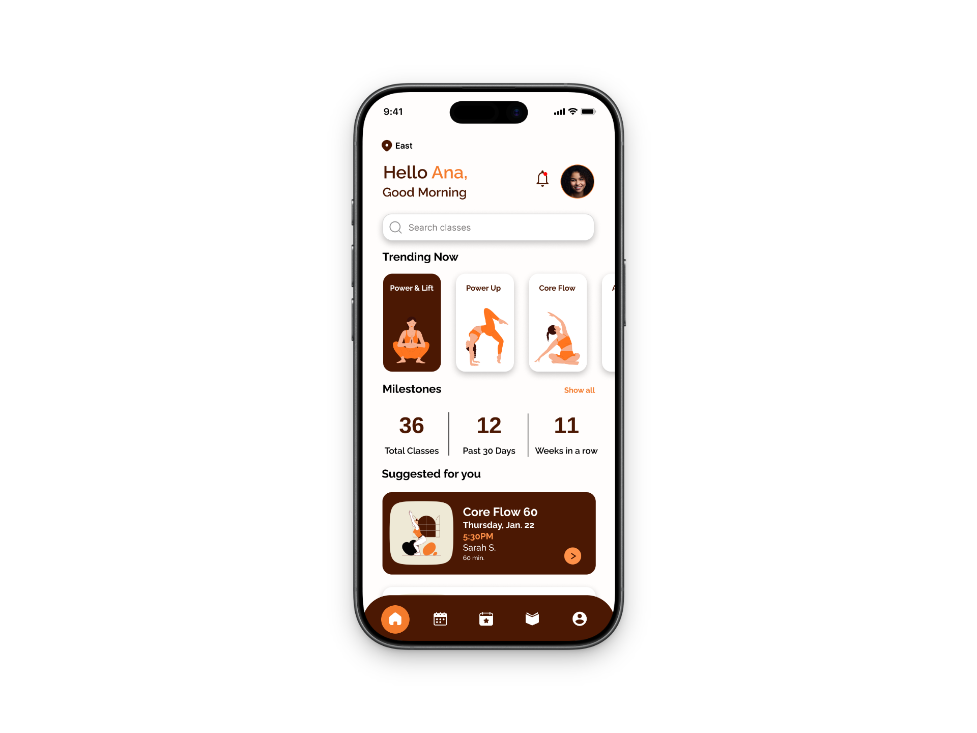
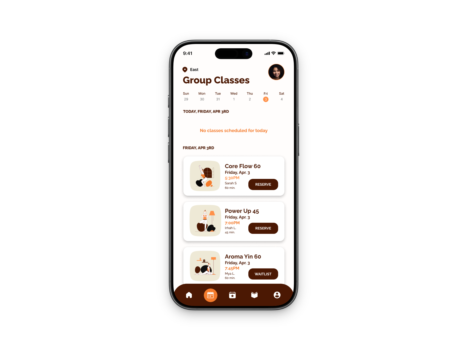
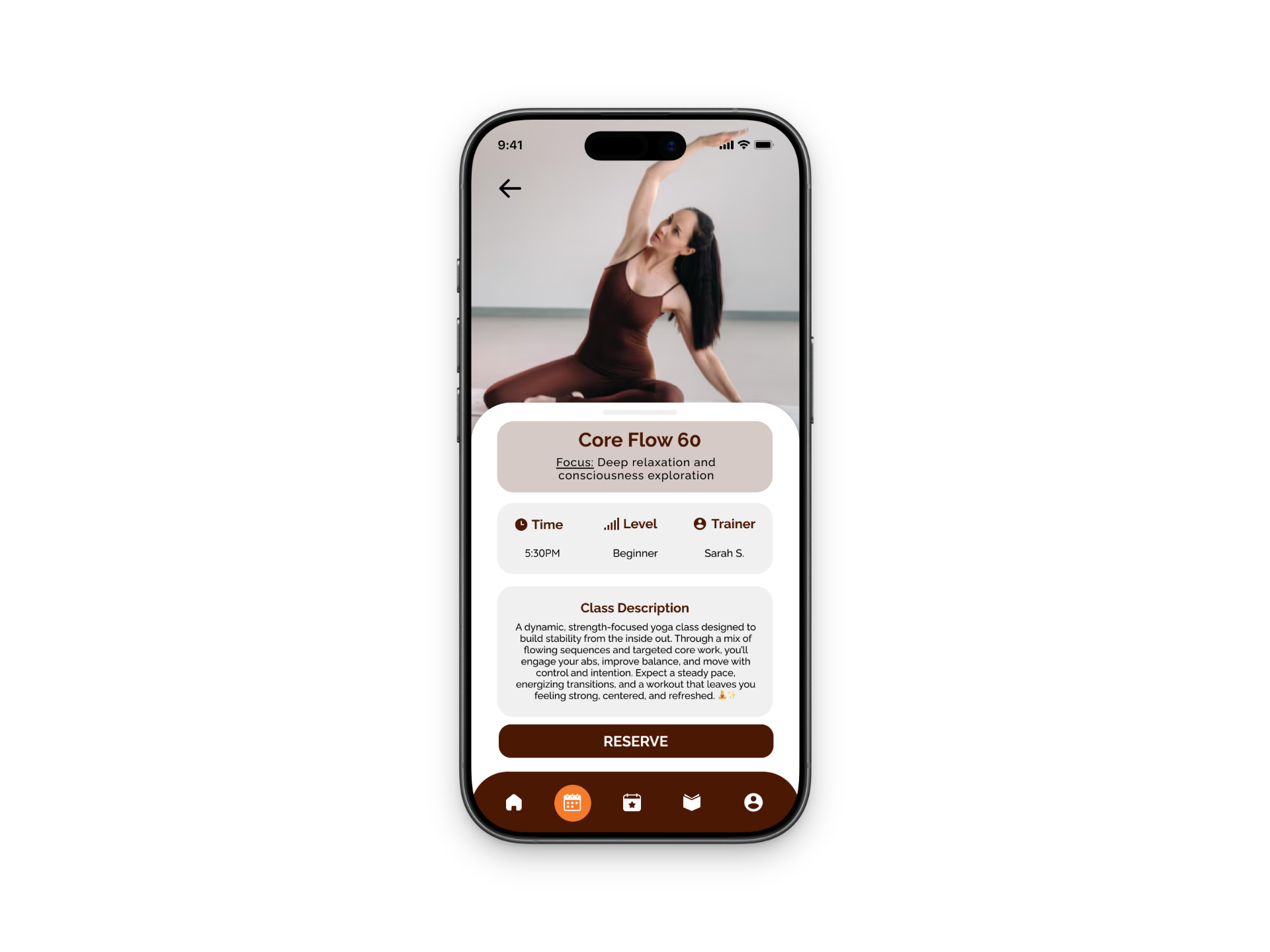
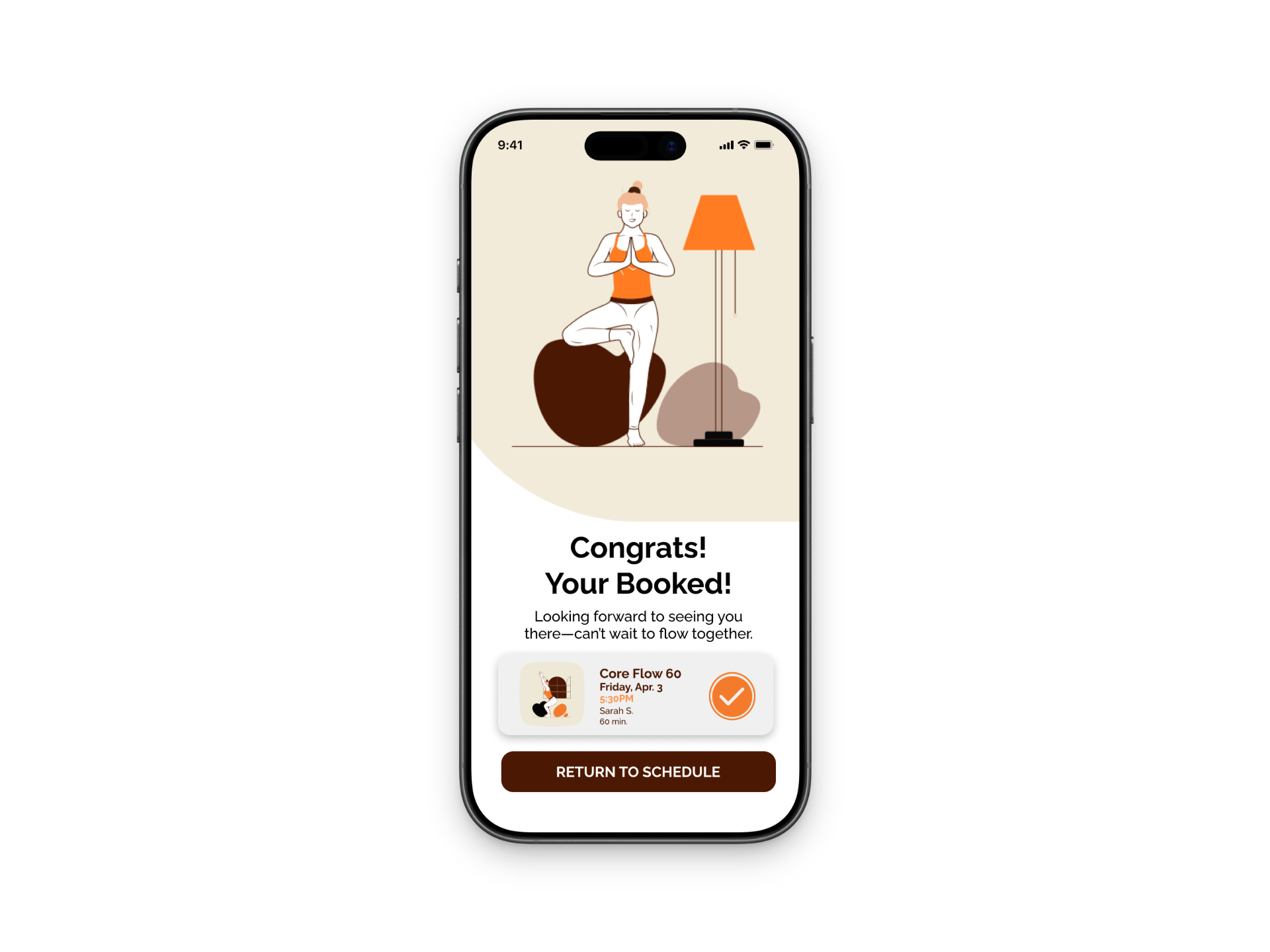
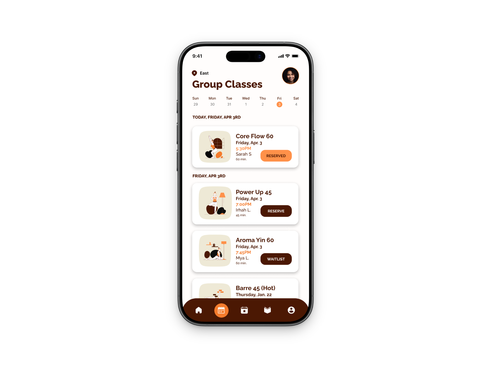
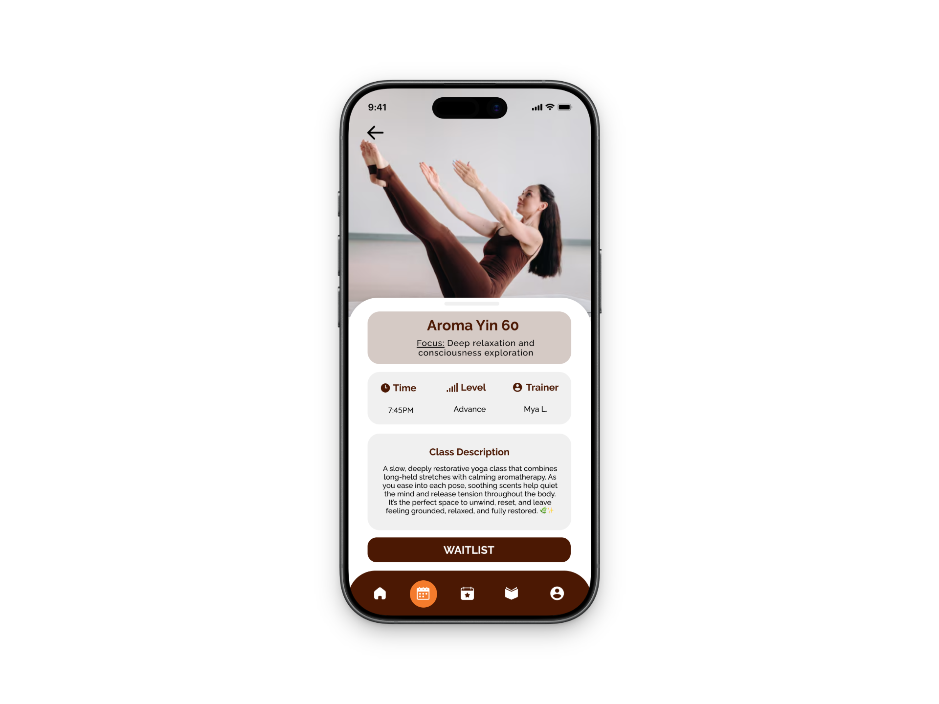
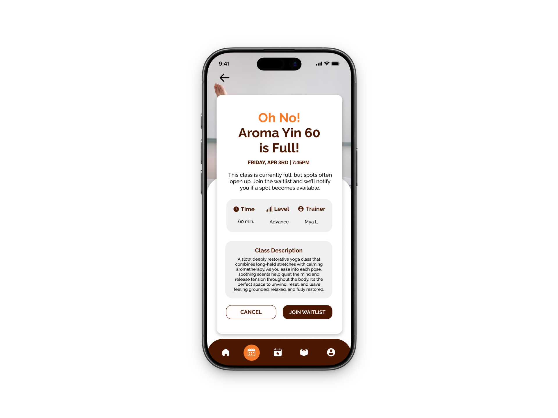
The prototype focuses on three main user flows: onboarding, booking a recommended class, and joining a waitlist when a class is full. During onboarding, users set their preferences like goals and experience level, which allows the app to suggest classes that fit them best. This helps reduce the stress of having to search through a bunch of options and makes the experience feel more tailored.
For booking, I made sure the process was really straightforward with clear class information and an obvious call-to-action. If a class is full, users can easily join a waitlist through a pop-up and are then encouraged to look at other available classes instead of just hitting a dead end. This keeps users engaged and still gives them options.
Visually, I kept the design clean and minimal with soft colors to match the relaxing vibe of yoga. I also focused on keeping things consistent, like button placement and spacing, so the app feels cohesive and easy to navigate.
Overall, this prototype reflects a user-centered approach by focusing on simplicity, personalization, and creating a smooth experience from start to finish.
REFLECTION
Through this project, I significantly strengthened my understanding of the end-to-end UX design process. Starting with a broad problem space around helping users feel more confident attending hot yoga, I learned the importance of clearly defining the problem before moving into solutions. Each phase, sketching, wireframing, and prototyping—helped me make more intentional, user-centered design decisions rather than focusing only on visual outcomes.
A key takeaway was the value of iteration. As I developed and tested different task flows, particularly around features like the waitlist, I found that initial ideas often needed to be refined to improve clarity and usability. Working in low-fidelity allowed me to quickly explore multiple directions, gather insights, and iterate efficiently without overcommitting to early designs.
I also focused on designing beyond functionality by considering the emotional experience of the user. This project highlighted how reducing uncertainty and building confidence can be just as important as completing a task. Keeping this in mind helped guide my decisions and ensured the final experience felt supportive and intuitive.
Overall, this project reinforced my ability to think critically, iterate effectively, and design with both user needs and business goals in mind, skills that I will continue to apply in future UX work.